Showing posts with label Satellites. Show all posts

Tuesday, 2 April 2019

February 2019 Global Temperature Update

Another brief summary of all the main global temperature data sets for February 2019. As before all anomalies have been recalculated to be relative to the 1981-2010 base period, which may mean that relative changes are different.

February was another month with little change. All data sets show the average temperature as being somewhat warmer than the base period, with anomalies around one third to a half a degree warmer. This is similar to the anomaly for January in most cases, but with HadCRUT and NOAA being around 0.1°C cooler. Compared with last February all data sets show this February being warmer, by around 0.1°C.

February
Dataset Anomaly Change from Last Month Change from Last Year Trend Since 1979 (per Century)
BEST 0.45 0.02 0.06 1.87
GISS 0.45 0.03 0.08 1.73
HADC 0.33 -0.09 0.14 1.7
NOAA 0.32 -0.11 0.09 1.63
RSS4 0.51 -0.01 0.16 1.98
UAH6 0.36 -0.01 0.16 1.28

February 2019 was between the 3rd and 6th warmest February depending on the data set. Here a couple of graphs showing temperatures for the month of February. (Note the scale for GISTEMP is to the 1951-1980 average.)

Predictions

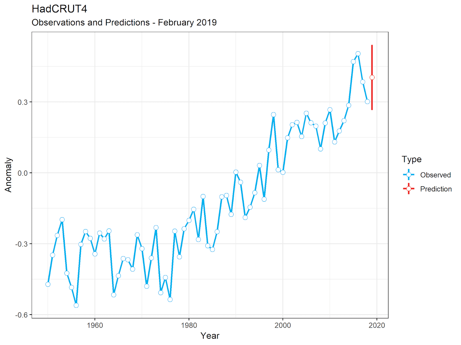
With not much change in the monthly anomalies, and these being close to the warming trend, there hasn't been much change in my predictions. The mid point prediction is virtually unchanged, at most down a few hundredths of a degree. All sets are suggesting there is a good chance of 2019 being warmer than 2018, but with only a small chance of being warmest. The biggest changes from last month is that all sets have reduced the probability of an absolute warmest year, simply because of the slightly narrower prediction intervals.

January - Predictions
Dataset Prediction Interval Top 5 Warmer Than 2018 Record Warmest
BEST 0.44 ±0.13 97.0% 71.0% 2.0%
GISS 0.44 ±0.13 97.5% 71.1% 2.4%
HADC 0.40 ±0.14 95.3% 92.8% 7.5%
NOAA 0.41 ±0.12 94.9% 84.1% 5.3%
RSS4 0.50 ±0.14 80.2% 95.8% 2.5%
UAH6 0.32 ±0.14 76.0% 91.3% 0.4%

A few graphs.

Final Observation

The fact that February was so warm might have came a shock to those who had been a very cold February, especially in the Northern Hemisphere. Here for example is an article on Watts Up With That, Amid the dimmest Sun since 1978 – a month without sunspots, from the 1st March claiming low sunspot numbers were causing severe winters.

It seems the sun has dimmed more than the usual amount at the end of solar cycle 24, and it could be a factor in the severe winter we are experiencing in many parts of the northern hemisphere.

But of course, cold winters in parts of the USA do not mean cold everywhere. Some parts of the Northern Hemisphere, such as the UK, were experiencing extremely warm, even record breaking, temperatures during parts of February, and even some parts of the USA, such as Florida, were very hot.

So strong was the conviction that February was going to be cold that when the UAH data was published in WUWT, here, showing Northern Hemisphere temperatures were 0.46°C above average, the comments erupted in accusations about the unreliability of satellite data, some even suggesting fraud and corruption. For example

Sorry, but this presentation does not pass the BS smell test. The northern hemisphere was featured in story after story about cold records, snow records, lake ice jams, etc, and in the southern hemisphere (where I live) producers are struggling with a decent harvest, which does not suggest a normal summer temperature. This all just does not add up to believable. Can somebody familiar with the data sets figure out what is wrong? Otherwise, I’m going with the obvious: BS!

How is this thing supposed to be measuring temperature? This is for the month of Feb, right?

We have had almost the coldest Feb on record…..we’re 61F right now….when we should be high 70’s to low 80’s

…and it says we’re +2 for the month

Something is definitely wrong…..

Que the usual apologist clergy to lie away the discrepancy.

This is why the contrarians here who constantly defend the constant adjustments and lie about temperature are lying liars who deserve no respect and no polite interaction. Denver Colorado was disastrously cold this year, significantly below average. This is pure Orwellian horse crap

It's all a long time (About 4 years) from the time when anyone who questioned the accuracy of satellite data was branded a satellite-denier.

And next months data from UAH is using an adjusted version showing slightly more warming.

Monday, 19 February 2018

Temperature Update - January 2018, the Satellites

This post starts my ongoing monthly summaries of global temperature anomalies from different data sets. In this I'll look at the two main satellite data sets - UAH 6, and RSS 4.

The anomalies (relative to their respective base periods) for January 2018 are

  • UAH 6: +0.26°C (Relative to 1981 - 2010)
  • RSS 4: +0.546°C (Relative to 1979 - 1998)

Translating RSS to the UAH base period would give RSS an anomaly of +0.401°C. Both are cooler than December 2017 - UAH down 0.15°C, RSS down 0.044°C.

In the UAH set January 2018 is the 10th warmest January. In the RSS set it is the 7th warmest.

These graphs show the monthly data across the satellite era, along with the trend and the 12 month moving average. January 2018 is highlighted in red.

In both cases Janury 2018 is very close to the long term.

Forecasts

Using my simple statistical model, the predictions for 2018 are that UAH will have an annual anomaly of 0.256 ±0.185°C, and that RSS will have an anomaly of 0.551 ± 0.167°C.

Note that in both cases the most likely prediction for 2018 is very close to the values for January. This is to be expected given the the fact that January was very average. But of course the uncertainty is large.

Predicting a specific ranking is probably foolish at this point, but both sets are looking to finish close to the current 5th warmest year of 2015. UAH has around a 55% chance of finishing below 2015 and 45% above, whilst RSS has more or less equal chances of finishing above or below 2015.

If UAH finishes below 5th place, it could end up just about anywhere as there are a lot of years with very similar values. It's unlikly to finish 1st or 2nd but there is around a 1 in 5 chance of UAH finishing 3rd or 4th.

For RSS there's a prety good chance (~40%) that it will finish between 2005 and 2015 for 6th place (owing to the big gap between the two), but only a slim chance (less than 10%) that it will finish below 6th. Though if it does it could finish just about anywhere. It has about a 1 in 7 chance of finishing 2nd.

As always these probabilities are based solely on past statistical inference and do not factor in the probability of a La Niña this year.

One Last Thing

As there will likely be a lot of talk of a returning pause as the next La Niña takes hold, it's worth seeing where we are in comparison to the previous powerful El Niño of 1998. (What am I saying? There have been talk of a return of a pause since 2016.) Anyway, this graph compares the 5 years surrounding 1998, with those surrounding 2016.

UAH 6 shows the least warming since 1998. But even with that data set, whilst the peaks of the two El Niños are similar, the years before and after have been considerably warmer.

Thursday, 2 November 2017

Temperature Update - October 2017, UAH 6

As always the first of the month's temperature updates is from the UAH Satellite data, reported by Dr Roy Spencer here. As with last month it's a surprisingly warm month.

The anomaly for October is reported as 0.63°C compared with the 1981 - 2010 base period. This makes it the warmest October in the UAH record, beating the previous record set in 2015 by 0.20°C. The three most recent Octobers have been the three warmest.

This means we are now seeing an unexpected uptick in the rolling 12 month average.

The year-to-date average is now 0.371°C, up from 0.342°C in September.

Predictions

My statistical prediction for 2017, with only two months to go, is 0.357 ± 0.043°C, compared with the prediction from September of 0.333 &pm& 0.058°C.

This rise in the predicted value for 2017 has had a dramatic effect on the ranking probabilities. Two months ago the prediction was below 2010, and it seemed most likely UAH would be the 4th warmest. Last month this had changed to a roughly even chance that 2017 would beat 2010 to finish 3rd. Now the odds on 2017 finishing 3rd have shot up, to over 86%. Intuitively this seems to high to me, as the last two months have been so anomalously warm, and one suspects some sort of correction is due, but for what it's worth here is the table showing the probability for each ranking.

Ranking Probabilities for UAH 6.0, Based on Data to October
Rank Year Anomaly Probability Change
1 2016 0.51 0.00% -0.00%
2 1998 0.48 0.00% -0.00%
3 2010 0.33 86.62% +37.44%
4 2015 0.27 13.38% -36.16%
5 2002 0.22 0.01% -1.26%
6 2005 0.2 0.00% -0.01%

Footnote

The fact that satellite data has been increasing whilst surface data has been decreasing, over the last couple of months, has been noted by Dr Spencer and Anthony Watts. Only a day before the latest UAH results were released Watt's Up With That were insisting global temperatures were cooling, based entirely on surface data from HadCRUT.

I've no idea why there is this apparent divergence. It maybe that the lower troposphere is gaining more heat than the surface, or it might be some error. If it is an error I suspect it will more likely be a problem with the satellite data than the surface data. But it is interesting seeing the so called skeptics, suddenly showing some much needed skepticism to the satellite data, and even emphasizing that satellites are not measuring the same thing as the surface data sets.

Thursday, 1 June 2017

The Pause in 2017 - Part 2: Monckton's Pause

The Great Pause of Monckton

This is the second part of a continuing series, looking at claims about the pause in 2017 (and already far behind schedule). In this episode I'm revisiting Christopher Monckton of Brenchleys Great Pause articles on Watts Up With That. These were a series of monthly articles, lasting almost two years, in which he would inform the public exactly, to the month, when the Great Pause started, how many months it had lasted, and how if only it would continue, the climate scare will become unsustainable.

The first Monckton pause article appeared on the 4th March 2014 in WUWT - No global warming for 17 years, 6 months>. This put the start date for the pause at September 1996. This was a very short piece, just two paragraphs, and says nothing about why he chose that month for the start of the trend, although it's obvious he cherry-picked it to get the result he wanted. In later, much much longer posts, he confirmed he was cherry-picking the start of each pause by calculating the earliest starting month that would still give a non-positive trend. By his final post on the subject in February 2016, the start date had moved forward 9 months to June 1997.

This is how Monckton starts his 2014 post

Seventeen and a half years. Not a flicker of global warming. The RSS satellite record, the first of the five global-temperature datasets to report its February value, shows a zero trend for an impressive 210 months. Miss Brevis, send a postcard to Mr Gore:

Saying there's not been a flicker of global warming, shows how misleading looking at a trend line in isolation can be. The graph fails to show the huge amount of global warming needed to reach the start of Monckton's pause.

The pause starts almost 0.25°C above the previous trend. Curiously, in Monckton's next pause article, No global warming for 17 years 8 months, he calculates how much warming there should have been during the pause, saying there should have been 0.22°C warming since September 1996. Yet if his pause trend is to be believed more than enough warming happened in a single month than his dubious calculations require.

This is what his original pause looks like now.

The trend since September 1996 is now stronger than the trend leading up to it. But both trends are a lot less than the trend over the entire satellite era - this is entirely due to the broken trend line resulting from cherry picking a meaningless split in the overall trend. By contrast, if you split the trends at the start of 1999 you can get a continuous pair of trends.

The later trend is 1.1°C / century, slower than the previous trend of 1.53°C / century, but the difference is not statistically significant, and there's still no firm evidence that a simple trend throughout the entire run is the best fit.

Cherry-picking the Data

All of Monckton's Pause claims are based on choosing RSS 3.3 satellite data. In a Pause update shortly before UAH 6.0 was released in beta format - El Niño or ñot, the Pause lengthens again, Monckton was insisting that RSS 3.3 was the least unreliable data set, and insisted that there was little statistical difference between the RSS and other datasets over the 18-year period of the Great Pause. This is true, but only because the confidence intervals for any trend over the last 18 years are very large, especially for satellite data. But this fact just highlights why it makes no sense to choose the set with the smallest trend and claim it as reality.

Waiting for the Return

Monckton's main goal has always to find the longest possible pause and attaches an odd significance to it one day reaching 20 years. At the end of his final article he puts it in the form of a Freedom Clock, saying

Finally, how long will it be before the Freedom Clock reaches 20 years without any global warming? If it does, the climate scare will become unsustainable.

Presumably as the pause stopped before reaching 19 years the climate scare is still sustainable, which is why there seems to be a lot of hope among true believers of the pause that it will shortly return. In Moncktons final article he says:

The current el Niño, as Bob Tisdale's distinguished series of reports here demonstrates, is at least as big as the Great el Niño of 1998. The RSS temperature record is now beginning to reflect its magnitude. If past events of this kind are a guide, there will be several months' further warming before the downturn in the spike begins.

However, if there is a following la Niña, as there often is, the Pause may return at some time from the end of this year onward. Perhaps Bob could address the likelihood of a la Niña in the next of his series of posts on the ENSO phenomenon.

I doubt there was ever any likelihood of the pause returning by the end of 2016. As things currently stand, even if temperatures were to drop to the levels seen during the La Niña years following the '98 spike, Monckton still won't see his pause return until 2019. But so far there's no sign of satellite data dropping to 1999/2000 levels.

In the mean time, it's possible to cherry-pick in the opposite direction - deliberately look for long stretches of fast warming trends. For example, using RSS 3.3, the earliest starting point where the trend was greater than 1.5°C / century is currently January 1982 - so for the past 35 years and 4 months temperatures have been rising at an accelerated rate (faster than the overall rate of warming) despite 18 years of that being the Great Pause.

Monday, 24 April 2017

Cold Winter Nights With Steve Goddard

Following on from my last post here's another interesting example of Tony Heller using odd statistics to make a point. In this case however it isn't so much the oddness of his statistics that are a problem, it's his entire argument. The post in question The Trouble With Satellites, which claims that satellites are exaggerating global warming by starting at an exceptionally cold period. It's a long post, but the only meat is in the first couple and final paragraphs, and can be summarized thus:

  1. Whilst Satellite data is infinitely better than surface data, it has a major problem in only going back to 1979.
  2. This was the coldest period in the US in the last 90 years, and so any rise in temperatures since then is misleading.
  3. Therefore Heller sees little or no evidence that Earth is warmer now than it was in 1940.

The first point is debatable - Heller obviously prefers satellites because they show slightly less warming especially this century - but both satellite and surface data have different problems and where there are differences there's no good reason to assume one must be correct and the other wrong. But I agree that one advantage surface data has over satellites is their longer reach. That satellites only going back 40 years makes it difficult to put any differences in perspective.

It's the second point that is the main problem. Heller says:

But there is a huge problem with satellite temperatures. They start in 1979, which was the coldest period of the last 90 years in the US. The frequency of below 0F (-18C) nights peaked in 1979, and then dropped in half by the year 2000, before starting to increase again.

One obvious problem here is that, as always he's only looking at the US, which tells us little about global temperatures. Even then, Heller is vague about what he means by 1979 being the coldest period in 90 years. His graph shows a 5 year rolling average of the percentage of days below 0°F, that's around -18°C in real money. As with his hot summer data this is a dubious way of measuring how cold the US was around 1979; obviously it's only going to show winter weather, and it will only be a small part of the US that will affect the graph.

As it happens, he didn't really need to go to all the trouble of inventing weird measures. NOAA's own website shows that 1979 was indeed the coldest winter on record, not just in the last 90 years. Beating the previous record set in 1936 by over 1°F.

NOAA - US Winter Temperatures

Even if, more logically, we look at the whole year, 1979 was also cold in the USA. Annual US temperature Not quite the coldest in 90 years (1929 beats it by a smidgen), but pretty much.

But if we look at the 5 year average, as Heller seems to be, we see that the first 5 years of the satellite era (1979-1983), was not at all the coldest period in the last 90 years.

NOAA - US 5 Year Mean Temperatures

But if we don't put America first, and instead look at global temperatures, the first 5 years of the satellite era were at a local high, warmer than the warm 1940s.

NOAA - Global Temperatures 5 Year Means

Heller's claim that satellites started at the coldest period of the last 90 years, is meaningless.

As far as hi closing remark that he can see no evidence that current temperatures are warmer than the 40s, this may well be correct as far as Heller's eyes are concerned. I assume he's not looking very hard, and can easily disregard any evidence to the contrary as fraud. But as an example that there is some evidence that temperatures are warmer than the 40s, we can use Heller's own technique of aligning 5 year averages at the start of the satellite era.

Wood For Trees

Satellite temperatures are around 0.4°C above the mid-40s peak. If we do what Heller seems to prefer and use land only data the warming is even greater compared with the 40s; around 0.7°C warmer.

Wood For Trees

One final point though, using the first 5 years of the satellite data as a base point is not logical. It makes an assumption that satellite and surface data precisely agreed with each other at the start and have been drifting apart ever since. But there's no reason to suppose the years 1979-83 were the the same - it's just as plausible that the satellites were too high (or the surface too low) at the start and are becoming more accurate later. In fact this seems quite likely when you consider that the first 5 years include a strong El Niño, and satellites usually show more warming than surface data during El Niños. Changing the offset slightly can produce a slightly more consistent comparison.

Wood For Trees

Sunday, 19 February 2017

Heller and the 5 Year Glitch

A quick lesson in how to deceive with statistics, from Tony Heller. In the post The Pause Is Real. NASA Temperatures Aren’t., Steve Goddard (aka Tony Heller) says

Satellites show no warming for twenty years – but fake NASA surface temperatures show lots of warming.

With this graph from Wood For Trees to illustrate the point.

Tony Heller's graph showing no warming in UAH 6 data, since 1997.

It's true that NASA's data shows lots of warming, but is it really true that satellites show no warming. Lets check this using the same data.

Graph showing some warming in UAH 6 data, since 1997. Wood For Trees

UAH definitely shows some warming, not the flat line Heller's graph shows. Both graphs use the same data, both show the temperatures using a 5 year rolling average, but whereas Heller calculates the trend line using the averaged data, I calculate it correctly - using the monthly data.

Using smoothed data is not the way to calculate a regression. In particular it reduces the influence of the start and end points of the period. In this case the first and last 2.5 years have less importance in determining the trend line than the middle 15 years, with the influence reducing as you move close to the start and finish. The most recent 30 months were quite a bit warmer than the first 30 months, so reducing their importance is sufficient to turn an overall warming trend into a slight negative trend.

This explains why the true linear regression looks out of place when compared with the 60 month rolling average. If we look 12 month rolling averages the picture becomes clearer.

Wood For Trees

To put some figures on the above, since the start if 1997, UAH 6 has been warming at the rate of 0.64 °C / century, compared to GISS's rate of 1.72 °C / century. The old UAH 5.6 has been warming at the rate of 1.60 °C / century.

Friday, 10 June 2016

Christopher Monckton on Speed

Several months after Christopher Monckton of Brenchley last had a post on WUWT concerning the 18 years of pause, he's returned with a new post - Introducing the global warming speedometer. This is much shorter then his previous reports, and fails to mention the Great Pause at all, instead concentrating on a new graph, which he describes as

A single devastating graph shows official climate predictions were wild

Actually, it isn't really new - just a straightened up version of the dial graphs he featured in his previous posts. Those graphs showed the warming rates of various data sets, but now he's dropped all data except the two satellite sets that show the least warming.

Monckton's Speedometer

I'm not keen on the style of graph; it's rather distracting and presenting the data on a circular dial makes no sense, except to make it look like a speedometer. But, in any event, a speedometer is a lousy metaphor for changing temperatures. A car's speedometer shows the instantaneous speed of a car, but that isn't a useful concept for temperature records, that change greatly from month to month. So the speedometer in Monckton's graph is showing a rate of change averaged over a longer period. But then you have to decide what length of time you are taking for the average. For Monckton's graph he's chosen to start in 2001. Odd, as last time he was insisting the Great Pause starting date was calculated, and not plucked arbitrarily from the ether, which he implied was the defining point of the end-point fallacy. Now he seems to plucking the start date out of the ether.

Monckton's Omissions
Here's my own version of the details of Monckton's speedometer, flattened out to make it easier to read.

Point graph, showing same data as Monckton's Speedometer

It's trying to show the disparity between IPCC projections compared with real observations. That is the two satellite sets showing temperatures in the lower troposphere - RSS 3.3, ignoring the newer RSS 4.0 and older UAH 5.6, both of which shows considerably more warming.

He shows the warming rate over a 15 year and 4 month period, and claims

Fifteen years is long enough to verify the predictions from IPCC’s first three Assessment Reports against real-world temperature change measured by the most sophisticated method available – satellites.

But he's wrong as can easily be seen by looking at the confidence intervals for these 15 years using this handy tool. RSS 3.3 shows only 0.36 °C / Century warming, but with a 2σ confidence interval of ± 2.26 °C / Century. We cannot say with any degree of confidence that the real rate of warming isn't in the IPCC's 2001 predictions, or even their 1990 predictions.

Here's the previous graph showing the rates of warming since 2001 for more data sets with their 2σ confidence intervals marked.

Comparison of various datasets with IPCC projections
The Missing Heat

The IPCC figures Monckton uses are projections for the period 1990 to 2025, but Monckton compares this with the 15 years from 2001 to present. He's implying that this slower rate will continue until 2025, which is dubious given the uncertainty in the trend, but he's also effectively tracing that lower rate back to 1990, and in so doing effectively hides much of the warming that has already occurred during the first decade of the IPCC's projection.

Trends for satellite data from 1990 and 2001

This graph illustrates the problem. It shows Monckton's preferred satellite data from 1990, the start of the forecast period. The green line shows Monckton's trend starting in 2001, the blue line shows the trend from 1990. The trend of speed since 1990 is 0.98 °C / Century, twice the speed Monckton uses, and very close to the lowest IPCC projection. (If you include May's figures the rate is now 1.19 °C / Century, within the lower bound.)

But the IPCC were not making a claim about the rate of change but the total change over a 35 year period.

Monckton uses projections from the first three IPCC reports (1990, 1995 and 2001). The 1990 report was based on simpler models and later reports have shown less warming, so I'll stick with the 2001 projections.

The values Monckton uses come from page 8 of the IPCC 2001 Synthesis Report:

For the periods 1990 to 2025 and 1990 to 2050, the projected increases are 0.4 to 1.1°C and 0.8 to 2.6°C, respectively.

Monckton translates this as:

IPCC (2001), on page 8, predicted that in the 36 years 1990-2025 the world would warm by 0.75 [0.4, 1.1] C°, equivalent to 2.1 [1.1, 3.1] C°/century. This predicted interval is 4.5 [2.3, 6.6] times observed warming since January 2001.

Introducing the global warming speedometer - Christopher Monckton of Brenchley

Aside from thinking that 1990 - 2025 is a 36 year period, when it's 35, he makes a couple of dubious changes. He says that the IPCC predicted the world would warm by 0.75 °C by 2025, when they only give a range of values. He's taken the mid point of the range as the expected amount of warming. But this assumes the projected range is symmetrical, which is unlikely if you look at the 1990 reports estimates.

Then he converts the projected warming into a rate of warming. The IPCC only say that 2025 is expected to be 0.4 to 1.1 °C warmer than 1990. This should be measured using an average of annual temperatures centered on those two dates - I'll use 20 year averages as this is the method specified in later reports. So the true measure will be to take the average temperature between 2016 - 2035 inclusive, and see if they are between 0.4 and 1.1 °C above the average temperatures for 1981 - 2000. We won't know for certain if this projection is correct until 2035, but how far off are they at the moment?

Here is a graph showing the running 20 year averages for Monckton's preferred temperature set, relative to the 1990 average.

Bar graph showing running 20 year means for satellite data

This goes up to 2005, the year centered on the 20 years from 1996 to 2015. The average in 2005 is 0.207 °C warmer than it was in 1990. That's more than halfway to the lower bound of the IPCC's projection, even though we are less than halfway through the projection period.

Translating this into Monckton's speed, we have a rate of warming since 1990 of 1.38 °C / Century, well within the IPCC's projections. Using the Hadley Centre's surface data, which is what the IPCC are referring to, the rate of warming since 1990 is 1.80 °C / Century - exactly in line with the IPCC's 1995 projection, and well within the 2001 projections.

The following graph shows the rolling 20 year averages, both for Monckton's satellite averages, and for HadCRUT4, along with a representation of the range of projections from the IPCC 2001 report.

rolling 20 year averages for HadCRUT ans Satellite data compared with IPCC projections

None of this guarantees that the IPCC projections will be met. If temperatures continue to rise in line with Monckton's speedometer, the 2025 figure would be 0.31 °C above the 1990 value. A bit short of the IPCC's lower bound of 0.4 °C, but much higher than Monckton is implying

Friday, 4 March 2016

Watts Does Not Like Upward Adjustements

That didn't take long. I wondered how the skeptics would react to the changes in RSS 4.0, when they had been so un-skeptical over the changes to UAH 6.0 beta. That same day Anthony Watts publishes a post called The 'Karlization' of global temperature continues - this time RSS makes a massive upwards adjustment, in which he basically accuses Carl Mears, chief scientist of RSS, of fraud in changing adjusting the RSS trend upwards. Some extracts give the flavor:

Forget homogenization, that is so 2010. If the pause is bothering you and your belief is that there must be more warming, we only need to find it in the data, then what you need is “Karlization”, named after director of the National Climatic Data Center, (now NCEI) Tom Karl who pulled a fast one this summer trying to adjust the past down, so the present would be warmer.

Now we have a new player in the Karlization process – Carl Mears, who is the chief scientist for RSS (Remote Sensing Systems) in Santa Rosa, CA. This is a private business that just happens to make a satellite based climate data set that is similar to the UAH satellite data set produced by Roy Spencer and John Christy.

Readers may recall a video produced by the execrable “Climate Crock of the Week” activist Peter Sinclair that we covered here where the basic premise was that the satellites are lying.

Clearly, he's miffed. So what to do? Taking a cue from the other Karl, he publishes a paper and claims that new and improved adjustments have found that missing warming.

I like the irony in this. Peter Sinclair is vilified for claiming the satellites are lying, yet Anthony Watts is doing exactly that, claiming you cannot believe RSS 4.0.

The only supporting evidence for this claim is a letter from Dr. Roy Spencer and Dr. John Christy (of UAH), who say they spotted a problem with the adjustments.

From what little we have looked at so far, it appears that they did not correct for spurious warming in NOAA-14 MSU relative to NOAA-15 AMSU ...see their Fig. 7c. They just leave it in.

Fair enough, I cannot really comment on whether this is a reasonable issue. But note that although it's been used for almost a year without criticism, UAH 6 could have just as many problems. We don't know as the methods have yet to be published.

What Watts' objection to the new RSS data really shows, is just how wrong the claims of impeccability for the satellite data are. Anthony Watts himself has objected to anyone criticizing satellite data, calling them satellite deniers, presumably with a sense of irony. The claim made by those who insist that satellite data be used in preference to ground based data is that satellites are unbiased, state-of-the-art and highly expensive. See here for example. All of which may be correct, but actually trying to calculate a global temperature from them requires complicated and fallible calculations, and these are built on many assumptions.

The fact that both UAH and RSS have made adjustments, which have resulted in major changes, proves that they cannot always be that accurate. If you take the Watts' line then UAH 5.6 was completely flawed, but we can trust 6.0 to be accurate - RSS 3.3 was the best data of all, but the person responsible is a fraud.

And as a passing thought, note that the objection above to RSS 4.0 is that it includes a satellite showing spurious warming. In other words, the satellites are lying.

Updates

Carl Mears has now posted more details of the RSS V4.0 adjustments here. This also seeks to address the flaw Roy Spencer claimed to have found:

First, we note that our treatment of NOAA-14, except for the diurnal adjustment, is unchanged from V3.3, so we do not understand how it can be the cause of two thirds the change. ... Clearly, the change in the diurnal cycle is the main cause of any differences between V3.3 and V4.0.

We agree that there is a problem with either NOAA-14 or NOAA-15, or both. We explicitly discuss the problem with the NOAA-14/NOAA-15 overlap in the paper. We do not know if the problem is due to NOAA-14 or NOAA-15. If we assume that all the drift is due to NOAA-14, as Dr. Spencer would like us to do, we can eliminate the use of NOAA-14 after 1999 so that its (potentially erroneous) trend during the overlap period does not affect the overall results. If we do this, the overall trend is decreased by 0.019K/decade.

...

These results are reported in the paper, and the differences between them should be viewed as part of the uncertainty in the final results. For the final dataset, we used case 3 where the errors are shared between NOAA-14 and NOAA-15, which is reasonable because we do not know the source of the problem.

Roy Spencer seems to agree with this in an update to his original blog post:

Chip Knappenberger has pointed out that, while the warming in RSS v4 versus UAH v6 might be as described above, when RSS v4 is compared to RSS v3.3, the increase in warming might be mostly due to their new diurnal cycle adjustment. In other words, the NOAA-14 calibration issue was also in their v3.3, but maybe it was obscured more by diurnal drift adjustment issues.

Some additional links:

Hot Whopper has a long look at Watts' and Spencer's claims - 101 conspiracy theories about troposphere temperature: the RSS love affair is over

Stoat - The RSS Middle Tropospheric Temperature Now V4.0, is much shorter, but makes interesting points about how professional the RSS presentation is compared with UAH.

Wednesday, 2 March 2016

Updates on Satellite Data

A couple of brief updates that are relevant to my previous post on Monckton's Pause.

UAH Latest Data

Whilst we wait for the RSS February 2016 temperatures, Roy Spencer has posted the UAH figure here. It's an astonishing 0.83 °C above the 1981 - 2010 average. That beats the previous monthly record by 0.09 °C.

Here's a graph showing monthly values. I've highlighted February 2016 along with the previous record month (April 1999).

This does seem something of an outlier, and I'm a bit suspicious of it. It will be interesting to compare it with the RSS figure.

RSS is being Updated

Gavin Schmidt reports there is to be a new version of RSS.

The abstract to the linked paper says:

The new methods result in improved agreement between measurements made by different satellites at the same time. We choose a method based on an optimized second harmonic adjustment to produce a new version of the RSS dataset, Version 4.0. The new dataset shows substantially increased global-scale warming relative to the previous version of the dataset, particularly after 1998. The new dataset shows more warming than most other middle tropospheric data records constructed from the same set of satellites. We also show that the new dataset is consistent with long-term changes in total column water vapor over the tropical oceans, lending support to its long-term accuracy.

This will very likely set the cat amongst the skeptical pigeons. Some commentators have been very certain that satellite data is nearly perfect, yet have a very selective attitude to what satellite data to use.

A couple of years back, RSS was showing little or no warming since the turn of the century, whilst UAH and all ground based measurements were showing continuing warming. At this point lots of skeptics were pointing out that satellites were more accurate than ground records, but only referring to RSS when they said that.

Last year UAH announced an update that brought UAH trends a lot closer to RSS, and suddenly UAH became acceptable with the same people who insist that any adjustment to ground based observations are evidence of fraud.

Now if RSS have a new version that shows more warming, will it be ignored or called fraudulent, by the same people who insist satellite data is the gold standard.

Update

This shows the overall change in the mid troposphere to increase the warming from 0.78 °C / Century, to 1.25 ° / Century. What I'm still not sure about, is how this will be reflected in the lower troposphere records, which are the ones usually used in comparison with surface data.