Showing posts with label forecasting. Show all posts

Friday, 29 June 2018

A Hurricane Waning from Piers Corbyn

I should have mentioned this earlier, but people of New Orleans are in grave danger. Piers Corbyn the alternative weather forcaster who claims to be able to predict the weather months in advance with proven skill verified by independent academic statisticians and published in scientific literature, has a message on his website, archived here warning of a hurricane that will hit near New Orleans.

WeatherAction* Public Hurricane Warning for likely Cat2 hit on Usa Gulf coast likely near NewOrleans about Jun29 +-1 day or so. Pass it on - WARN any contacts you know in Usa

*This warning is in line with WeatherAction policy to make LongRange Forecasts public when dangerous weather is likely.

I realize I might have left this a little late to pass on the warning, it already being the 29th, and with no forecast of any event from the official sources (or charlatans as Piers would have it).

Wednesday, 7 December 2016

Tracking 2016 - November Satellite Update

Here's the latest in my ongoing look at how 2016 is shaping up temperature wise. This includes all data sets up to October 2016, and all the satellite sets (excluding UAH 5.6) for November.

Monthly anomalies for each data set - based on period 1981 - 2010.

All the satellite sets rose in November, with UAH beta 6 setting a record for November by some way. In fact it beat the record set in 2015 by 0.12 °C. This also means that the 12 month rolling average set a new record, 0.52 °C, 0.04 °C warmer than the peak in 1998. RSS 3.3, was only the second warmest November, losing to the previous record (set in 2015) by 0.07 °C. The current version of RSS 4, for TTT, also set a record for November, beating 2015 by an impressive 0.18 °C.

Projections for difference between each data set and its previous record year.

The projected amount by which each set will beat its previous record haven't changed too much. November saw a small rise in projections for UAH 6 and RSS 4, but a small reduction in RSS 3.3. UAH 6 and RSS 3.3 are now very similar, with both looking to be around 0.2 - 0.4 °C warmer than 1998.

Changing probability by month of each data set beating its previous record.

The projected probability of 2016 setting a record hasn't changed much, with the notable exception of UAH beta 6, which now jumps from a 75% chance in October to a 97% chance. I think this is more reasonable than before. With only one month to go UAH beta 6 will have to be -0.02 °C in December, a drop of 0.47 °C from November - not impossible by not very likely.

Roy Spencer agrees that it now seems virtually impossible for 2016 to not be a record warm year in the UAH dataset, but then points out that it will probably not be statistically significantly different to 1998 given the uncertainties in the satellite dataset adjustments. This is probably true, and it's good to see confirmation that there are uncertainties and that the satellite data set is adjusted. However, it also seems a little disingenuous - not being statistically different only means there may be a small chance that 1998 was warmer, but then if every other data set also shows 2016 being warmer than 1998, possibly by bigger margins it becomes much less likely that they are all wrong.

In any event, it really doesn't matter which year was warmer, it will make very little difference to the underlying trends.

One Other Thought

Something David Rose mentioned in his recent Sunday Mail article:

This means it is possible that by some yardsticks, 2016 will be declared as hot as 2015 or even slightly hotter – because El Nino did not vanish until the middle of the year.

Firstly, it's looking very likely that all yardsticks will be showing 2016 as being warmer than 2015. Secondly, I'm really not sure what he means by slightly hotter.

Of the 4 surface data sets I've been looking at, NOAA and HadCRUT are the two likely to be close, currently estimated to be around 0.05 °C warmer than 2015, but may drop a bit over the next two months. The other two, BEST and GISS are both looking like being more than 0.1 °C warmer

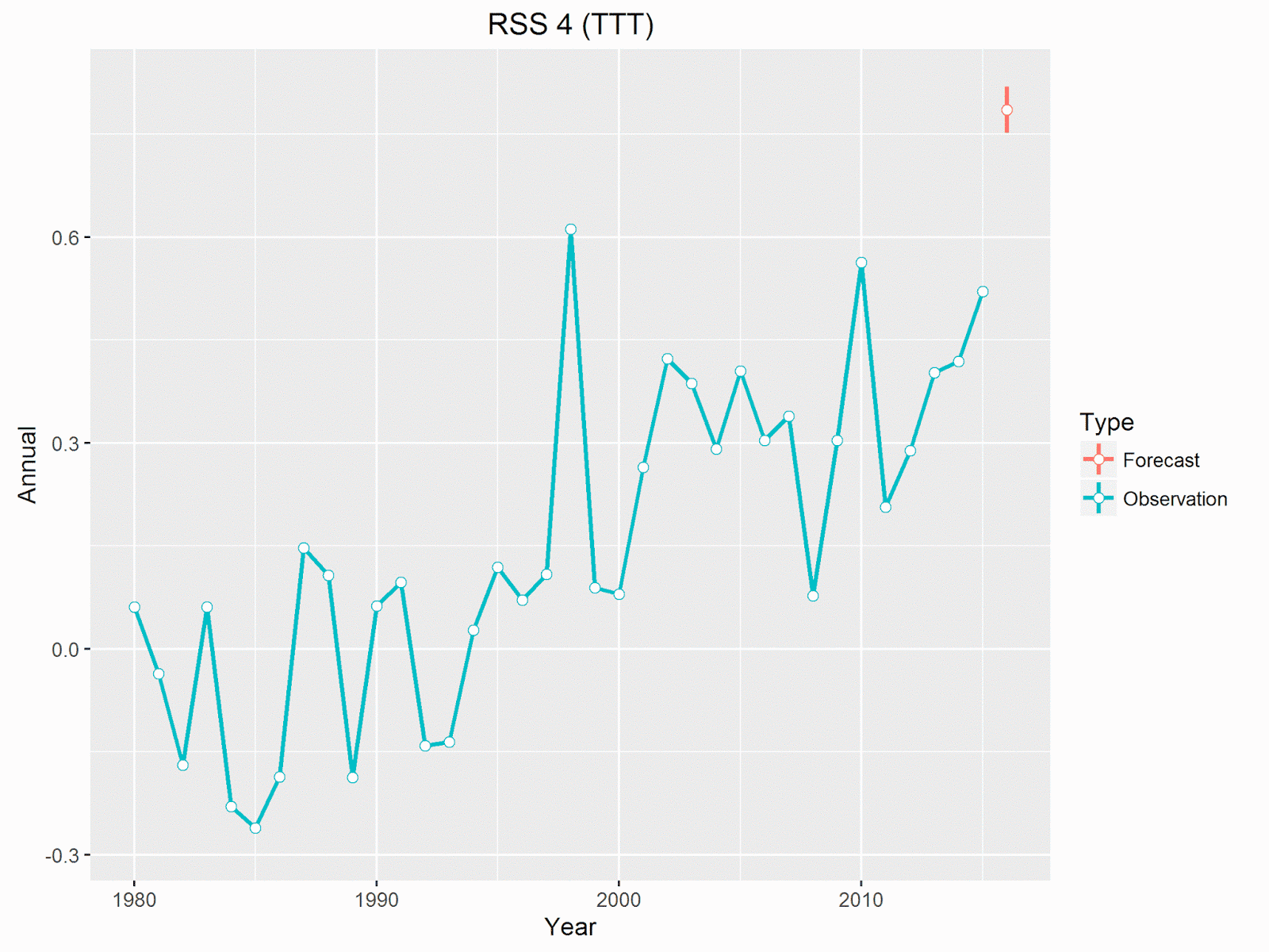
Satellite data is currently projected to beat 2015 by even more (remember in the satellite data 2015 wasn't anything like as warm as 1998). All 4 data sets, both the old and the new UAH and RSS, are projected to show 2016 as beating 2015 by around 0.2 - 0.25 °C.

Here's what this looks like for the two latest satellite data sets.

Annual temperature anomalies for UAH beta 6, with projection and 95% prediction range for 2016. (Prediction based on data through November.)
Annual temperature anomalies for RSS 4 (TTT), with projection and 95% prediction range for 2016. (Prediction based on data through November.)

Neither of these suggest 2016 will be only slightly hotter than 2015.

Friday, 30 September 2016

New Dawn for Piers Corbyn

Good News!

It has now been conclusively proved that global warming is not a problem. The science is settled. That at least is the impression Piers Corbyn came away with from a recent 2 day conference in London.

He documents it on his WeatherAction site.

The amazing international parade of excellent Presentations from highly qualified and informed scientists and researchers in meteorology, astrophysics and other professions in Meteorological production and academia proved beyond a shadow of doubt that the man-made climate change story is a pack of lies and delusional nonsense both in general terms and in every specific field of claims involving temperatures, sea levels, ice and weather extremes.

He goes on to say (in red)

... no honest scientist can now come forth with any evidence that the Climate Change story is anything other than a heap of POLITICALLY DRIVEN delusional nonsense and fraud.

Fortunately I am not not a scientist, honest or otherwise, so can talk about the evidence.

New Dawn

The conference was called The New Dawn Of Truth which sounds like it's either a new age magazine or the latest neo-fascist party. with a logo that could apply to either. (As far as I can see, there's no relation with the New Dawn magazine.)

The two day conference was put on by an organization calling itself the Independent Committee on Geoethics, whose members include Christopher Monckton. It's surprising this revolutionary conference hasn't received more attention on skeptical sites - Watt's Up With That carried one story about it (written by Christopher Monckton, a founding member of the committee), but with a disclaimer from Watts:

While I carry this story on WUWT for informational purposes, that should in no way imply that I endorse the topics of the conference itself or the speakers.

But since then there's only been an oblique reference in this post, where he says that on seeing a couple of the papers I knew then I would not attend this conference, even if invited. This post did not go down to well with one of the other presenters at the conference, Roger Tallbloke.

Piers Corbyn's Contribution

Corbyn's presentation - The total failure of the ManMade Climate Change story. has a slide show here. There's also a video of his 20 minute lecture which doesn't add much to the slides. Considering the promises of the title it's all rather disappointing - nothing new at all. Just the same arguments he's been putting forward for years and mostly the same slides, not even updated to reflect the fact it is now 2016.

However, it does give me an excuse to comment on a few of Piers Corbyn's claims.

Self Promotion

Around a quarter of the slides (and half the lecture) are about how good Corbyn's WeatherAction is at forecasting the weather. He's implying that this proves CO2 is not responsible for climate change. That's because his forecasting relies on the claim that solar activity controls the weather - and therefore is the only factor that controls the climate. But his logic is wrong.

  • Even if his forecasts were accurate it would not prove that solar activity was the cause of the weather. Corbyn keeps his methods a closely guarded secret, but they include factors other than solar activity. Unless he publishes his research there is no way of knowing how much his success is due to solar factors.
  • Even if solar activity could be used to predict weather, it would not prove that the sun controls the climate. Climate and weather are very different things.
  • Even if the sun does have an effect on the climate (it probably does), this does not mean that CO2 has no affect on the climate.

Moreover, I've yet to see any convincing evidence from Corbyn or anyone else that he can predict the weather, especially not to the level of confidence he claims. The bulk of his claimed accuracy is just confirmation bias - remembering the times when he's got something correct, but forgetting all the times he's been wrong. Thus he has slides confirming his prediction of heatwaves last month (August 2016), his prediction that July 2012 would be very wet, the Great Storm of October 2013, and the exceptional cold of December 2010. But they make no mention of his failures - that December 2011 would be exceptionally cold (it was a degree above average), that May 2012 would be one of the coldest in 100 years (the month as a whole had average temperatures), that February 2014 would be one of the driest in 100 years with drought developing in the South (it was one of the wettest) that August 2014 would likely be the hottest on record (it was the only month that year to be below average). Most of these he predicted with greater than 80% confidence, sometimes as much as 95%. (All the above are forecasts for the UK.)

Even his claimed successes on closer examination are not always the spot-on successes he implies. Take his forecast for July 2012 (slide 53). The headline in the slide is The Apocalyptic deluges of July 2012 were well captured in WeatherAction DETAIL 45-75d ahead. July was certainly wet, twice as much rainfall as average - but the forecast makes more specific claims.

Rainfall likely to be (90% confidence) wetter than July 2007 in England and Wales and in the 12 wettest Julys in 247 years of records since 1786. Wettest or in 4 wettest Julys in 100 years in SE England.

But the data shows (Met Office Hadley Centre) none of those forecasts were correct.

  • Rainfall for England and Wales July 2007 was 137.9mm, July 2012 was 120.7mm.
  • July 2012 was the 33rd wettest July in the England and Wales 247 year record.
  • July 2012 was the 13th wettest July in the 100 year SE England set.

What Piers Corbyn fails to do is provide any statistical analysis that his results are better than chance, let alone the claimed 85% accuracy made from months in advance. The closest thing to actual evidence is a single paper which he claims showed significant skill. The problem is that this paper, by Denis Wheeler, failed to show any significant skill. In particular it looked at a two year period of forecasts for storms in the UK, and failed to show a statistically significant correlation between the forecasts and actual storms over winter months.

Cycles

In several slides Piers talks about cycles influencing the weather. These cycles are claimed to come from the sun and the moon, but his evidence is scarce and the various cycles presented are contradictory. The sun has an 11 year sun spot cycle and this is thought to have some influence on the climate, but according to Piers it's the 22 year Hale cycle that matters more, and this is modulated by a lunar cycle every 9.3 or 18.6 years. (Slide 17)

On slide 18 he explains how this leads to a 132 - 133 year cycle, corresponding to how these two cycles interact. He explains that 6 x 22 = 132, and 7 x 19 = 133. This at least makes some sense; if the sun and moon affect climate then there might be a corresponding beat when both are at there strongest. Except he's already said the lunar cycle is 18.6 years, not 19, so there should be a peak every 130 years, not 133 as he claims. This wouldn't be much of a problem if we were only talking about approximate lengths of time, but Corbyn is claiming an exact period - or at least his only evidence is the fact that a short sequence of UK summer flooding repeated a pattern exactly every 132 years.

But then he starts talking about an approximately 60 year cycle (slides 24 and 25), which he also claims is governed by the same solar and lunar cycles. You cannot fit a 60 year cycle into a 132 year cycle and claim that both are governed bhy the same two factors. It also means that the 60 year cycle is not in step with the 11 or 22 year solar cycle. If one 60 year cycle starts when the sun is at solar maximum, the next will start when the sun is at its minimum.

The only evidence for these cycles is a pair of graphs showing rises in temperature happening approximately 60 years apart - except the trend lines appear to have been stuck on in order to confirm the 60 year cycle. Even then there isn't much consistency. In the graph showing USA temperatures for example, there is a claimed warming peak in 2002/3 (based on just 5 years of data), but the previous peak happened 70 years earlier.

From slide 24 - Attributed to JD'Aleo Sept 2008.

Piers Corbyn explains how he gets a 60 year cycle from the solar and lunar cycles on slide 24 using this equation, B - n - 2H, where n is twice the inverse of the Lunar nodal Retreat rate, and H is half Z. Z = 1 / Sunspot period = 1/11.1 /yr. (Why he didn't use Z rather than 2H I don't know.) Inverting B gives his ~58 year cycle.

There's no explanation as to why this equation makes any physical sense - it looks like he simply played around with equations until he got the result he wanted. Possibly the explanation is on slide 32 when he says:

Things are not always what they seem!

In Physics Drawing a diagram or writing an equation does not mean that you are showing something real

It's Cooling

It is one of Corbyn's main claims that we have entered a new mini-ice age, or a period of global cooling. That is he doesn't just claim there was a pause, he's claiming there's been actual global cooling. But obviously he provides no evidence to support the claim, and is very vague as to when he thinks this started.

So what we get is lots of strong assertions. Sometimes these are predictions of imminent cooling Solar Activity Predicts Major COOLING (slide 36), other times he's claiming there has been actual cooling - Real temperatures are falling as CO2 warmist models rise (slide 47), BUT Whatever they do, even with 'new' data the WORLD IS COOLING while CO2 still rises (slide 48),

The problem is all these claims are based on meaningless time scales producing insignificant cooling. For example on slide 38 he claims there was cooling between 2007 and 2013. Any cooling over that period would be indistinguishable from noise. In any event he's wrong - all datasets including satellite data show a warming trend from 2007 to 2013.

Temperature trend calculator
Finally - More Termites

Of course he's still got it in for the termites. Slides 41 and 42 both make the false claim that they produce 10 times as much CO2 as humans.

Monday, 12 September 2016

Temperature Update - August

Now that we have all of the Satellite data and two of the surface data sets for August, I'll post a brief update to my ongoing prediction series, rather than wait till the end of the month for HadCRUT.

Anomalies for 2016 (1981 - 2010 base period)

With the exception of RSS 3.3 all data sets have shown an increased anomaly for August.

An interesting point is that with August UAH beta 6 has now beaten its record for warmest consecutive 12 month period. The anomaly for the last 12 months have been 0.496 °C, compared with the previous record set at the end of 1998 of 0.482 °C. This means that all datasets are showing the world as having just had its warmest 12 months on record.

But what about the all important calendar year?

Forecast for annual anomalies relative to previous record year

The forecast for the two surface sets has increased slightly, all of the satellite sets have decreased slightly. The two cool satellite sets are edging close to the 1998 value. UAH beta 6 is only now forecast to beat 1998 by 0.03 °C.

Forcast probability of beating previous record

A very slight drop in probability for the two cool satellite sets, 86% for RSS 3.3, 76% for UAH beta 6. All other sets that have posted August values are greater than 99%.

Continuing to look at UAH beta 6, as it's the least certain and undoubtedly gain the most attention if it doesn't beat the record (thus proving there is no global warming!). The average of the first 8 months of 2016 is slightly less than that for 1998. (0.566 °C verses 0.573 °C) To beat the 1998 record the remaining 4 months will need to average more than 0.315 °C per month, slightly more than the last 4 months of 1998 which averaged 0.3025 °C. Here's the comparison between 2016 and 1998, with the dashed line showing the average needed for 2016 to equal 1998.

Comparison of UAH beta 6 for 1998 and 2016

For comparison, here's the older version of UAH, which looks almost certain to beat the record.

Comparison of UAH 5.6 for 1998 and 2016

Sunday, 31 July 2016

Predicting 2016 from June - Satellite Data

Disclaimer

All the temperature sets are in for June 2016, so it's time to update my predictions. But first I want to emphasize that I don't claim to agree with these forecasts. My main intention was to disagree with those claiming back in April that there was 99% certainty that 2016 would set a record. My assumption has always been that the earlier predictions were overstated, and that it would become clear one way or another over the coming months. But at this midway point I think things are even less clear, and may be exaggerating the likelihood of a record even more.

I also want to point out that whilst speculating on which years will be records is interesting, it doesn't tell us much about the trend in global warming. Annual temperatures are fairly arbitrary. A single record does not prove global warming is happening, and a lack of records certainly does not prove warming is not happening.

Roy Spencer of UAH has been talking about the likelihood of UAH beta 6 setting a record as well. In June he was predicting that 2016 will likely be record in the satellite data., but after the June figures showed a large drop he's now suggesting it's unlikely to set a record . So I want to look in more detail at UAH beta 6, which is the least typical of all the data sets. Spoiler - I also think it's unlikely to set a new record this year.

Updates for June

I'm monitoring 7 data sets; the three main terrestrial sets - GISTEMP, NOAA and HadCRUT, and 4 versions of the satellite data - UAH 5.6, UAH beta 6, RSS 3.3, and RSS 4.0. RSS has not so far released version 4 for the lower troposphere so I'm using their product for the total troposphere (TTT), which is the closest to TLT. Here's how the years been progressing for each set (all anomalies based on the period 1981 - 2010).

Most of these data sets showed a drop in June. The exceptions being NOAA and HadCRUT that both showed a small rise.

Here are the graphs showing how the projected year end total has changed throughout the year.

This graph shows the expected annual temperature compared with the previous record year (1998 for satellite data, 2015 for terrestrial data). All of the data sets show a drop in the forecast (compared with the forecast from May), except for HadCRUT which has a small rise. How has this effected the probability of a record year?

Surprisingly there hasn't been much change, with the noticeable exception of UAH beta 6, which drops from 88% to 80%. All others show 90% - 100% certainty. RSS 3.3 and HadCRUT swapped places, with RSS dropping from 94% to 92%, and HadCRUT rising from 92% to 95%. NOAA remains at 98% and the others, GISTEMP and the other satellite versions are greater than 99%.

Summary of Forecasts
Set Probability Margin
GISTEMP 1.00 0.16
HadCRUT 0.95 0.10
NOAA 0.98 0.11
RSS 3.3 0.92 0.09
RSS 4.0 1.00 0.20
UAH 5.6 1.00 0.21
UAH beta 6 0.80 0.05
How The Calculations Were Made

In order to get some idea of where these forecasts come from I'll go through the process using UAH beta 6 as an example. For context here's the annual observations along with the forecast (in red) for 2016. The vertical line indicates the 95% interval.

The forecast is to be quite close to the 1998 record, and much warmer than any other year.

The forecast is based on the correlation between the annual temperature and the first 6 months for each year.

This suggests there has been a strong linear correlation between the temperature at the start of the year and the final temperature. There are a few reasons why this correlation shouldn't be a surprise

  • The annual figure includes the initial values. In other words, by this point half of the annual figure has already been determined.
  • The temperatures for both the start of the year and the whole year are correlated with the underlying trend. That is, because temperatures have increased over time, and years that starts warm are likely to be from the warmer period, and so are more likely to see a warmer end to the year.
  • There is some correlation between the start and end of the year even allowing for the underlying trend. That is years that start unusually hot for their time are more likely to remain unusually hot.

The expected temperature can be read straight from that graph. The start of 2016 has been a little warmer than the start of 1998, and 1998 was quite close but a little below the predicted value.

One note of caution is that a fair proportion of the trend line is only supported by two years, 2010 and 1998. On the other hand, it does show that both the strong El Niño years finished up close to their predicted values.

The trend line gives us the expected temperature for the year. This is the temperature we'd expect to get on average, if we had a large number of years all starting with the same temperature. In order to estimate a probability of beating any specific temperature we need to generate a distribution for the range of specific values. This is obtained by calculating the prediction interval (by which I mean I get R to calculate it). I then hack the figures a bit to get the correct scale. The distribution looks like this.

The dotted line shows the 1998 record anomaly, and the shaded are shows where 2016 has to be to beat it. This translates into an 80% probability of beating the 1998 record.

How Plausible are These Forecasts?

Taking another approach (that used by Roy Spencer) we can look at what actually needs to happen in the second half of 2016 to beat the record. For UAH beta 6 the second half of 2016 has to average more than 0.348 °C (using UAH's 1981 - 2010 base period). This compares to the first 6 months of 2016 which was 0.617 °C, and the second half of 1998, which was 0.373 °C.

For 2016 not to be a record would require the biggest difference between the first and second halves of the year in the UAH record. The biggest difference was in 1998 when temperatures dropped by 0.239 °C. By contrast 2016 will need to drop by 0.269 °C - so either way 2016 will set some sort of record!

Here's what 2016's monthly values look like compared with 1998, with the dotted line showing the average temperature needed for the rest of the year to break the record.

Although 2016 started off considerably warmer than 1998, the last two months have shown a much quicker drop than anything seen in 1998. Temperatures will actually need to increase from the June figure to beat the record, but if 2016 reflects the pattern of 1998 temperatures should continue dropping. If this happens there would be no chance of 2016 beating 1998.

It seems likely that temperatures will continue to drop, as they did in 1998, but it's not certain as 2016 is not behaving in the same way as 1998. Overall, based on intuition rather than statistical inference, I suspect the odds on UAH beta 6 setting a record are low - say around 10%.

So why would the statistical analysis be so wrong? In some ways I don't think it is actually wrong, it's just that it predicts the general case. Saying there is an 80% chance of record means that if we had a large number of different years, all starting with the same temperature, 80% would be warmer than 1998, but it doesn't predict which specific years will be in that 80%. You can always bring more knowledge about what a specific year is doing that will suggest if this particular year will be in that 80% or not.

I have tried other statistical approaches, and want to introduce at some point one that gives a better overall performance. This combines the underlying trend with the start of the year, but I'm reluctant to use it at this stage as it actually increases the probability of a record, going in completely the wrong direction to what I expect to happen.

A more accurate statistical method would probably require more advanced methods, such as deep learning, which is outside my experience.

Additional Comments

Whilst it is interesting that despite the strong start to the year UAH beta 6 will probably not set record this year, that tells us little about the state of global warming. For a start we are only talking about one data set, and one that is still unofficial and unpublished. Whilst I'd reduce the odds on all the other data sets breaking a record, they all have more chance than UAH beta 6. My estimates for the other data sets would be that RSS 3.3 has around a 50% chance of setting a record, and the other sets all have 75% or more. (These estimates are as above just my gut feeling.)

UAH beta 6 is dominated by the exceptional value it gives for 1998. 2016 is still likely to be close to the 1998 value and 2016 is very likely to be at least the 2nd warmest year in their history, and is almost certain to be warmer than 2015.

What makes 1998 so unusual is that it came out of much cooler conditions. The two years preceding, and the two years following 1998 were all close to the 1981 - 2010 average. They were warm by 20th century standards, but cold compared to the 21st century. By contrast 2016 follows two very warm years. Possibly one reason this El Niño is dropping more quickly than 1998 is that it has already produced more heat over the previous year. This graph compares monthly values for the three years leading up to 1998 and 2016.

One consequence of this is that the two years 2015 and 2016 are almost certain to be the warmest 2 consecutive years on record, and the three years from 2014 - 2016 will be the warmest 3 consecutive years on record.

The Other Satellite Data Sets

For completeness, here's what the other versions need to do to beat their respective records..

All of them can afford to drop some more and still beat 1998.

Update - 1st August

No sooner had I written the above, when Roy Spencer announces that the UAH beta 6 value for July 2016 showed a slight increase on the June value - up to 0.39 °C.

This hasn't had too much of an impact on my forecasts. The statistical method shows a slight reduction in the probability of this data set breaking a record, down to 78%. I'd still agree with Spencer that UAH will beat the record this year, but the fact that the temperatures went up must increase the odds slightly, if only because it suggests more uncertainty in the temperatures.

Tuesday, 31 May 2016

Predicting 2016 Temperatures - Part 1

Introduction

Most of the global temperature sets have been published up to April 2015 and they all continue to show the globe is very warm. GISS in particular has had 7 months of record breaking anomalies, with every month since October 2015 being more than a degree above the base line average (1951 - 1980).

Of course, this spike in temperatures is generated by the current El Niño conditions, and temperatures will fall back later in the year.

This leaves a question as to whether 2016 will be another record breaking year, in some or all data sets. Personally I don't care too much for emphasizing annual records, as it's a distraction from the long term trends - a single record warm year does not prove the trend is upwards, and a lack of records over a certain period does not mean warming has stopped. Nevertheless, records are fun and if 2016 is a record it will be remarkable given that it will be the 3rd record year in a row for land based observations. For the satellites the question is whether 2016 will finally break the long standing record set in 1998.

It's something of a risky move predicting a record, given how the doubters will use anything you say in evidence against you - If you predict a record that doesn't happen it will be prove that all your forecasts are wrong, in it does happen it will be evidence that the figures are fraudulent. So I was intrigued by a couple of tweets Gavin Schmidt made over the last couple of months, saying that it was more than 99% certain that 2016 would be a record at least as far as GISS goes.

Aside from the wisdom of making himself such a hostage to fortune, I was also suspicious of the idea that 3 or 4 months in you could be so confident. So I've been looking at the statistics myself. This proved to be so interesting, that I think I might try to do a month by month summary.

Simple Correlation

The first question is how much correlation has there been in the past between the first 4 months of the year and the final Annual temperature.

The correlation is remarkably good, and looks pretty linear. I was surprised at how strong the correlation was, but on reflection there are a couple of reasons why this shouldn't be so surprising. First, by April a third of the year has already been locked-in. More importantly as temperatures have warmed in general it's natural that this will increase both the annual average and the starting average.

Using this line to predict 2016, we get a forecast of 1.08 ° C, with a 95% prediction interval of 0.94 - 1.23. This compares with the current record set all the way back in 2015 of 0.87 ° C. From this I estimate the probability of 2016 setting a record in GISTEMP at 99.8%.

This graph puts the forecast in the context of previous annual temperatures. The vertical line represents the 95% prediction interval.

Is this a reasonable prediction? I'd be extremely cautious about reading to much into this simple analysis. For one thing, extrapolating from a trend is dangerous when you move outside the range from which the trend was calculated. In this case the average for Jan-Apr is far warmer than anything seen before, so it's impossible to know if the trend would continue linearly. The red dot in the next graph shows where our prediction sits on the line.

In addition any probability is only the probability of a record assuming the assumptions of the model are correct. There will always be a lot of factors that such a simple model does not take into account, and given the probability is so high, there's a reasonable chance that any additional factors will reduce that probability. One thing in particular is that this model does not take into account the fact that this is an El Niño year, and that it is almost certain that temperatures will drop during the rest of the year. Though looking at the last big El Niño year, 1998, that ended up very close to the predicted value. I want to look at more complicated forecast models in a later post.

All of the above has been with regard to the GISS temperature set, but we can use the same method to look at other sets.

For NOAA the probability of a record is slightly less, partly because 2015 was somewhat warmer, 0.9 ° C, and partly because the start to 2016 hasn't been quite as warm in NOAA as in GISS. The prediction for NOAA using this method is 1.01 ° C, with a probability of 97.9% of beating the 2015 record.

For HadCRUT4 the probability of a record year is only 91.7%.

For the satellite data the current record goes back to 1998, and the two versions of data sets used which show the smallest amount of warming, RSS 3.3 and UAH beta 6, show the most uncertainty. RSS 3.3 is projected to beat 1998 by 0.13 ° C, with a 95.5% of a record. UAH beta 6 is projected to beat 1998 by 0.08 ° C, with a 87.0% chance of a record.

By contrast UAH v5.6 has a 99.9% chance of being a record, and RSS TTT 4.0 has a 99.7% chance. It's curious that for UAH the newer, but still unpublished, version is the data set with the greatest chance of not being a record, but the older official version has the most chance of any set of beating the record.

Here's what the UAH beta 6 forecast looks like in context.

This table summarizes the probabilities and margins for all data sets. I'm showing the expected value as a margin over the previous record, rather than as an anomaly to avoid confusion between the different bases used for each set.

Set Probability Margin
GISTEMP 0.998 0.22
HadCRUT4 0.917 0.12
NOAA 0.979 0.15
RSS 3.3 0.955 0.13
RSS 4.0 (TTT) 0.997 0.25
UAH 5.6 0.999 0.26
UAH Beta 6 0.870 0.08
Changes over time

Here's a graph that shows how the probabilities have changed since the January figures.

and here's a graph showing projected difference between 2016 and the previous record in degrees C.

Conclusion

I think it's very likely that most and probably all data sets will show 2016 as being the warmest year on record. But I would be pretty skeptical about the very high probabilities obtained by this simple method. All of the above statistics should be considered just for fun and I take no responsibility for any losses occurred by anyone taking bets. My main interest in all this is to see how the forecasts, using this simple method, change over the year.

Update

This post was updated on to include HadCRUT4 figures for April.