Friday, 15 March 2019

Narcissistic President of The USA Believed Fox News Claims

One shouldn't bring attention to the current idiocy in charge of the USA, not when my own Government is in the process of bringing the UK to the edge of a precipice. But this particular tweet from Donald Trump repeats such a common place fallacy that it it's worth going over why it's wrong.

On the 12th of March 2019 the President of the United States of America thought it worth his time to tweet:

Ignoring the question of whether Patrick Moore was a co-founder of Greenpeace (he says he was, Greenpeace say he wasn't), or why it matters, the issue I'm focusing on is the claim that in fact carbon dioxide is the main building block of all life.

I have two main problems with this: 1) it's irrelevant and 2) it's not correct.

Irrelevant

It's irrelevant because it's implying that something either has to be good or bad and cannot be both. In fact many things are important or essential for life but can also be deadly in other contexts. Water is essential for life, but even a small amount can drown you. Iron is essential for life, but you wouldn't want to be hit on the head by an iron bar. Sunlight is the source of all life, yet that doesn't mean you can ignore the risks of sunburn. (The people who argue for more CO2 on the grounds that it's the gas of life rarely argue for more solar panels despite solar energy being the source of nearly all energy.)

Incorrect

Now it's a fact that carbon dioxide is essential for the life cycle, but it is not correct to call it the main building block of life. It's carbon that is the main building block of life, carbon dioxide is just the main delivery system for carbon.

A very simplified description of the role of carbon in the life cycle of plants and animals goes something like this:

  • Plants absorb carbon dioxide from the air.
  • Plants use energy from the sun to convert the carbon from CO2 into carbohydrates, releasing oxygen in the process. The carbon as a store for solar energy.
  • During the night plants burn some of the carbon for energy, creating carbon dioxide which they release into the atmosphere.
  • Animals do not use carbon dioxide at all. They either eat plants or other animals, stealing the carbon and energy stored by the plants.
  • Animals burn carbon for energy by breathing in oxygen and combining it with the stored carbon, producing carbon dioxide as a by product
  • This carbon dioxide is breathed out as a waste product.

The point of this is that whilst it's often suggested that carbon dioxide is a live giving chemical, the reality is that for humans and other animals it's at best useless and at worst harmful and even deadly. It's an irony that long before anyone coined the term gas of life, carbon dioxide was mainly know as a killer gas.

None of this, of course, has anything to do with the problem of CO2 emissions. The problem with increasing atmospheric CO2 is the danger of increasing the greenhouse effect and so warming the planet. Nothing to do with whether you view it as beneficial to your health or not.

Thursday, 7 March 2019

Temperatures - January Summary

Belatedly here's a brief summary of all the reports of global temperatures for January 2019.

I'm trying a different format this year, and only intend to release single reports for all the main data sets at the end of each month, when all the data is in. One major change is that I want to use a consistent base line, so all anomalies are translated into anomalies relative to the years 1981-2010. I'm not promising I will keep this up all year - it might depend on how much I can automate the work.

Observations

All surface data sets have January at around 0.4 - 0.45°C warmer than the 1981-2010 average, with satellite data not too dissimilar. UAH was a bit below 0.4°C and RSS a bit above 0.5°C. In all cases this is up around 0.1°C compared with last January. UAH have 2019 as the 6th warmest January, all other data sets have it as the 4th warmest.

This table summarizes some of the details

January
Dataset Anomaly Change from Last Month Change from Last Year Trend Since 1979
BEST 0.44 -0.03 0.08 1.88
GISS 0.43 -0.06 0.11 1.71
HADC 0.41 0.08 0.18 1.71
NOAA 0.43 0 0.16 1.64
RSS4 0.52 0.12 0.11 1.98
UAH6 0.37 0.12 0.11 1.28

Hopefully that's not too confusing. It shows each data set, with the anomaly for January in Celsius compared with the 1981 - 2010 base period. It also shows the change of that anomaly compared with the previous month (December 2018) and compared with the same month last year (January 2018). Finally it shows the trend since 1979 in Celsius per century. 1979 is used as a start date for consistency with the satellite data.

Predictions

Too soon to take any predictions seriously, but on the basis of one month the prediction would be for 2019 to essentially the same as January, purely on the basis that January was very close to the long term trend.

This table lists the predicted values in °C compared with the 1981-2010 average, and gives the probability of reaching various milestones. So far on the basis of one months data, it seems probable that 2019 will be warmer than 2018, and for surface data, very likely to be one of the 5 warmest years on record. Satellite data is also likely to be in the top 5, but this is less certain due to the strength of 1998 and 2010 in the satellite data. There is a small chance that 2019 will be the warmest year on record, purely due to the natural uncertainty of the coming months, but realistically this seems unlikely to me unless there is a big El Niño in the coming months.

January - Predictions
Dataset Prediction Interval Top 5 Warmer Than 2018 Record Warmest
BEST 0.45 ±0.14 96.6% 72.0% 3.0%
GISS 0.44 ±0.14 97.4% 71.7% 3.8%
HADC 0.42 ±0.15 95.8% 93.8% 14.5%
NOAA 0.44 ±0.14 96.6% 87.7% 13.2%
RSS4 0.50 ±0.16 76.1% 92.7% 5.0%
UAH6 0.32 ±0.18 70.2% 85.0% 1.7%

Finally here are some of the predictions in graph form.

Monday, 11 February 2019

2018 Temperature Roundup

Somewhat belatedly, due to the weirdness of American government and the fact I've had better things to do, here is the final round up of 2018.

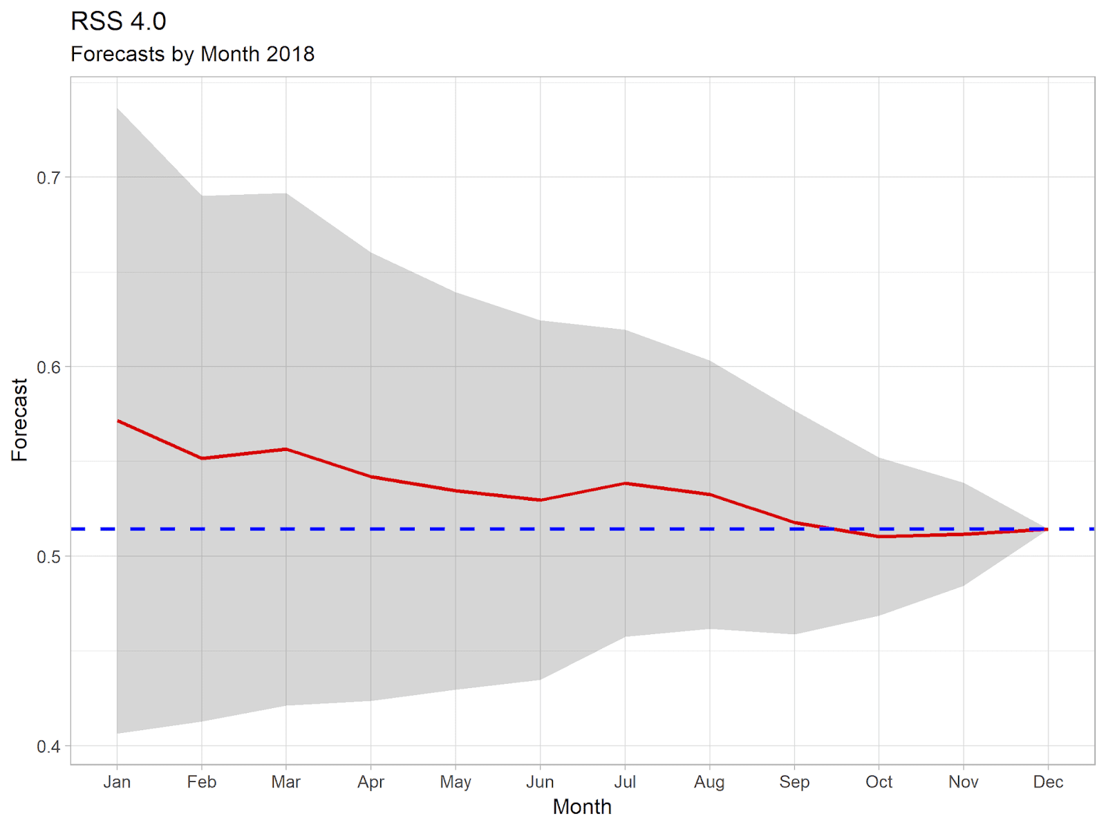
This is going to be very brief, with just the graphs showing annual temperatures for each data set, along with a graph showing how my forecast progressed through the year. The forecast graph shows a red line representing the predicted annual anomaly after each month's data had been released, and a grey area showing the 95% confidence interval in that prediction. The blue dotted line shows the final figure for 2018.

Note, that as always the predictions have been calculated from current data. Actual forecasts made at the time might have been different as the initial release of monthly data is provisional and generally changes as more data is added.

Temperature's in 2018

Both satellite data sets show 2018 as being the 6th warmest. All surface data sets show 2018 as being 4th warmest. The main difference here is that satellite data shows the strong El Niño years of 1998 and 2010 as being much warmer than surface data sets.

UAH and HadCRUT, could be considered to be statistically tied for 6th or 4th place respectivly, in other cases there is little doubt about the rankings. All surface data sets show the last 4 years to have been the 4 warmest on record, and all but BEST show the last 5 years to have been the 5 warmest on record. Satellite data shows the last 4 years to have been 4 of the 6 warmest years on record, with only 1998 and 2010 spoiling the clean run.

More importantly, all data sets continue to show a consistent warming trend since the 70s. For UAH this trend is around 1.3°C / century. For all other sets this is around 1.7 - 1.9°C / century. All data sets show 2018 as being very close, if slightly below, the trend. Of course, none of this will stop the usual claims in some quarters that there has been rapid cooling since 2016.

As for my predictions, I'd have to say that this year they were remarkably accurate even from January, rarely more than a few hundredth of a degree out. I'd like to suggest this shows how amazing my simple prediction algorithm is, but in reality it just reflects the fact that 2018 was a very dull year, with little variation in monthly temperatures and all close to where you'd expect given the trend.

Satellite Data

UAH
RSS

Surface

HadCRUT
GISTEMP
BEST
NOAA

Friday, 7 December 2018

Temperature Update - November 2018, RSS

Data

According to the RSS Satellite data, November was 0.530°C warmer than the 1979 - 1998 average. This is slightly cooler than last month's anomaly, by less than a hundredth of a degree. It was the 4th coolest November since satellite records began, with the last 4 Novembers being the 4 warmest on record.

Monday, 26 November 2018

Temperature Update - October 2018, HadCRUT

According to the Met Office and Haley Centre global temperature analysis, HadCRUT, October 2018 was 0.687°C above the average for 1961-1990. This makes October the warmest anomaly of the year, and the 2nd warmest October on record.

Saturday, 17 November 2018

Temperature Update - October 2018, GISTEMP

According to GISTEMP, global temperatures for October 2018 were 0.99°C above the 1951-1980 average. This is quite some rise, though you shouldn't put too much store in any individual month. It's up by 0.25°C from last months anomaly and is the warmest monthly anomaly of the year. It puts 2018 as the 2nd warmest October in the GISTEMP history, starting in 1880.

Friday, 9 November 2018

Temperature Update - October 208, Satellites

A late and cut down update for the two satellite data sets.

Neither set was that interesting, both had a slightly higher anomaly than September, but both well down on last year's record October values. October for UAH was 0.22°C, the equal 9th warmest October, RSS was 0.53°C, the 5th warmest. (Remember these anomalies use different base periods.)