Several months after Christopher Monckton of Brenchley last had a post on WUWT concerning the 18 years of pause, he's returned with a new post - Introducing the global warming speedometer. This is much shorter then his previous reports, and fails to mention the Great Pause at all, instead concentrating on a new graph, which he describes as
A single devastating graph shows official climate predictions were wild
Actually, it isn't really new - just a straightened up version of the dial graphs he featured in his previous posts. Those graphs showed the warming rates of various data sets, but now he's dropped all data except the two satellite sets that show the least warming.
I'm not keen on the style of graph; it's rather distracting and presenting the data on a circular dial makes no sense,
except to make it look like a speedometer.
But, in any event, a speedometer is a lousy metaphor for changing temperatures.
A car's speedometer shows the instantaneous speed of a car,
but that isn't a useful concept for temperature records, that change greatly from month to month.
So the speedometer in Monckton's graph is showing a rate of change averaged over a longer period.
But then you have to decide what length of time you are taking for the average.
For Monckton's graph he's chosen to start in 2001.
Odd, as last time he was insisting the Great Pause starting date was calculated
, and not plucked arbitrarily from the ether
, which he implied was the defining point of the end-point fallacy.
Now he seems to plucking the start date out of the ether.
Monckton's Omissions
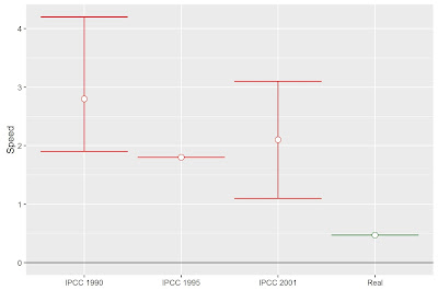
Here's my own version of the details of Monckton's speedometer, flattened out to make it easier to read.
It's trying to show the disparity between IPCC projections compared with real
observations.
That is the two satellite sets showing temperatures in the lower troposphere - RSS 3.3, ignoring the newer RSS 4.0 and older UAH 5.6,
both of which shows considerably more warming.
He shows the warming rate over a 15 year and 4 month period, and claims
Fifteen years is long enough to verify the predictions from IPCC’s first three Assessment Reports against real-world temperature change measured by the most sophisticated method available – satellites.
But he's wrong as can easily be seen by looking at the confidence intervals for these 15 years using this handy tool. RSS 3.3 shows only 0.36 °C / Century warming, but with a 2σ confidence interval of ± 2.26 °C / Century. We cannot say with any degree of confidence that the real rate of warming isn't in the IPCC's 2001 predictions, or even their 1990 predictions.
Here's the previous graph showing the rates of warming since 2001 for more data sets with their 2σ confidence intervals marked.
The Missing Heat
The IPCC figures Monckton uses are projections for the period 1990 to 2025, but Monckton compares this with the 15 years from 2001 to present. He's implying that this slower rate will continue until 2025, which is dubious given the uncertainty in the trend, but he's also effectively tracing that lower rate back to 1990, and in so doing effectively hides much of the warming that has already occurred during the first decade of the IPCC's projection.
This graph illustrates the problem.
It shows Monckton's preferred satellite data from 1990, the start of the forecast period.
The green line shows Monckton's trend starting in 2001, the blue line shows the trend from 1990.
The trend of speed
since 1990 is 0.98 °C / Century, twice the speed Monckton uses, and very close to the lowest IPCC projection. (If you include May's figures the rate is now 1.19 °C / Century, within the lower bound.)
But the IPCC were not making a claim about the rate of change but the total change over a 35 year period.
Monckton uses projections from the first three IPCC reports (1990, 1995 and 2001). The 1990 report was based on simpler models and later reports have shown less warming, so I'll stick with the 2001 projections.
The values Monckton uses come from page 8 of the IPCC 2001 Synthesis Report:
For the periods 1990 to 2025 and 1990 to 2050, the projected increases are 0.4 to 1.1°C and 0.8 to 2.6°C, respectively.
Monckton translates this as:
IPCC (2001), on page 8, predicted that in the 36 years 1990-2025 the world would warm by 0.75 [0.4, 1.1] C°, equivalent to 2.1 [1.1, 3.1] C°/century. This predicted interval is 4.5 [2.3, 6.6] times observed warming since January 2001.
Aside from thinking that 1990 - 2025 is a 36 year period, when it's 35, he makes a couple of dubious changes. He says that the IPCC predicted the world would warm by 0.75 °C by 2025, when they only give a range of values. He's taken the mid point of the range as the expected amount of warming. But this assumes the projected range is symmetrical, which is unlikely if you look at the 1990 reports estimates.
Then he converts the projected warming into a rate of warming. The IPCC only say that 2025 is expected to be 0.4 to 1.1 °C warmer than 1990. This should be measured using an average of annual temperatures centered on those two dates - I'll use 20 year averages as this is the method specified in later reports. So the true measure will be to take the average temperature between 2016 - 2035 inclusive, and see if they are between 0.4 and 1.1 °C above the average temperatures for 1981 - 2000. We won't know for certain if this projection is correct until 2035, but how far off are they at the moment?
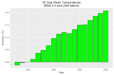
Here is a graph showing the running 20 year averages for Monckton's preferred temperature set, relative to the 1990 average.
This goes up to 2005, the year centered on the 20 years from 1996 to 2015. The average in 2005 is 0.207 °C warmer than it was in 1990. That's more than halfway to the lower bound of the IPCC's projection, even though we are less than halfway through the projection period.
Translating this into Monckton's speed, we have a rate of warming since 1990 of 1.38 °C / Century, well within the IPCC's projections. Using the Hadley Centre's surface data, which is what the IPCC are referring to, the rate of warming since 1990 is 1.80 °C / Century - exactly in line with the IPCC's 1995 projection, and well within the 2001 projections.
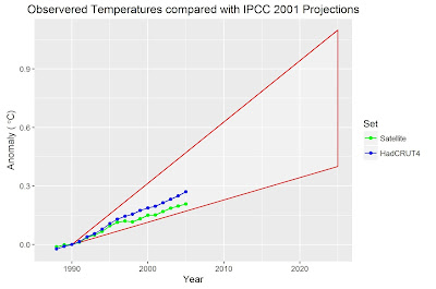
The following graph shows the rolling 20 year averages, both for Monckton's satellite averages, and for HadCRUT4, along with a representation of the range of projections from the IPCC 2001 report.
None of this guarantees that the IPCC projections will be met. If temperatures continue to rise in line with Monckton's speedometer, the 2025 figure would be 0.31 °C above the 1990 value. A bit short of the IPCC's lower bound of 0.4 °C, but much higher than Monckton is implying


No comments:
Post a Comment