Wednesday 7 December 2016

Tracking 2016 - November Satellite Update

Here's the latest in my ongoing look at how 2016 is shaping up temperature wise. This includes all data sets up to October 2016, and all the satellite sets (excluding UAH 5.6) for November.

Monthly anomalies for each data set - based on period 1981 - 2010.

All the satellite sets rose in November, with UAH beta 6 setting a record for November by some way. In fact it beat the record set in 2015 by 0.12 °C. This also means that the 12 month rolling average set a new record, 0.52 °C, 0.04 °C warmer than the peak in 1998. RSS 3.3, was only the second warmest November, losing to the previous record (set in 2015) by 0.07 °C. The current version of RSS 4, for TTT, also set a record for November, beating 2015 by an impressive 0.18 °C.

Projections for difference between each data set and its previous record year.

The projected amount by which each set will beat its previous record haven't changed too much. November saw a small rise in projections for UAH 6 and RSS 4, but a small reduction in RSS 3.3. UAH 6 and RSS 3.3 are now very similar, with both looking to be around 0.2 - 0.4 °C warmer than 1998.

Changing probability by month of each data set beating its previous record.

The projected probability of 2016 setting a record hasn't changed much, with the notable exception of UAH beta 6, which now jumps from a 75% chance in October to a 97% chance. I think this is more reasonable than before. With only one month to go UAH beta 6 will have to be -0.02 °C in December, a drop of 0.47 °C from November - not impossible by not very likely.

Roy Spencer agrees that it now seems virtually impossible for 2016 to not be a record warm year in the UAH dataset, but then points out that it will probably not be statistically significantly different to 1998 given the uncertainties in the satellite dataset adjustments. This is probably true, and it's good to see confirmation that there are uncertainties and that the satellite data set is adjusted. However, it also seems a little disingenuous - not being statistically different only means there may be a small chance that 1998 was warmer, but then if every other data set also shows 2016 being warmer than 1998, possibly by bigger margins it becomes much less likely that they are all wrong.

In any event, it really doesn't matter which year was warmer, it will make very little difference to the underlying trends.

One Other Thought

Something David Rose mentioned in his recent Sunday Mail article:

This means it is possible that by some yardsticks, 2016 will be declared as hot as 2015 or even slightly hotter – because El Nino did not vanish until the middle of the year.

Firstly, it's looking very likely that all yardsticks will be showing 2016 as being warmer than 2015. Secondly, I'm really not sure what he means by slightly hotter.

Of the 4 surface data sets I've been looking at, NOAA and HadCRUT are the two likely to be close, currently estimated to be around 0.05 °C warmer than 2015, but may drop a bit over the next two months. The other two, BEST and GISS are both looking like being more than 0.1 °C warmer

Satellite data is currently projected to beat 2015 by even more (remember in the satellite data 2015 wasn't anything like as warm as 1998). All 4 data sets, both the old and the new UAH and RSS, are projected to show 2016 as beating 2015 by around 0.2 - 0.25 °C.

Here's what this looks like for the two latest satellite data sets.

Annual temperature anomalies for UAH beta 6, with projection and 95% prediction range for 2016. (Prediction based on data through November.)
Annual temperature anomalies for RSS 4 (TTT), with projection and 95% prediction range for 2016. (Prediction based on data through November.)

Neither of these suggest 2016 will be only slightly hotter than 2015.

Saturday 3 December 2016

Stunning New Nonsense From David Rose

I'll have the next update for 2016 soon, but with Roy Spencer announcing that UAH rose slightly in November, it seems highly likely that all datasets will make 2016 the warmest year on record. The joke has always been that in a few years time this will lead to 2016 being declared the start of a new pause.

Except we didn't have to wait that long. In the last few days there's been a flurry of nonsensical articles pointing to the rapid decline of temperatures following on the peak of the recent El Niño, as evidence for the end of global warming, or the start of a new ice age, or whatever.

Tamino has some great articles detailing the sorry history:

Here's my own take. This started with an article in a Mail on Sunday article by David Rose, with the catchy headline Stunning new data indicates El Nino drove record highs in global temperatures suggesting rise may not be down to man-made emissions . The headline claims in the article are:

Global average temperatures over land have plummeted by more than 1C since the middle of this year – their biggest and steepest fall on record.

The news comes amid mounting evidence that the recent run of world record high temperatures is about to end.

The fall, revealed by Nasa satellite measurements of the lower atmosphere, has been caused by the end of El Nino – the warming of surface waters in a vast area of the Pacific west of Central America.

The second two points are obvious and irrelevant. Of course the run of record breaking weather will end, it would be terrifying if it didn't. And you don't need NASA to tell you that the end of an El Niño causes a fall in temperatures.

Tellingly, Rose never quotes a source for the data he's using, but it's clearly the RSS v3.3 TLT land data. But using that source his claim that temperatures have plummeted by more than 1C since the middle of this year is not correct - they've dropped about 0.5 ° C since the middle of the year - you have to go back to March to make the case for a drop of 1 °C.

Rose claims that this is the biggest and steepest fall on record, but doesn't back this up with any figures. Nor does he really explain what significance he attaches to this fall. If the fall is simply the fall from a very high peak, it means nothing and is expected. If he's suggesting that this trend is meaningful and will continue he's almost certainly going to be wrong. (In fact as I write November's RSS figures have been published and show land temperatures rose by over 0.2 ° C.)

But he's wrong to claim that this is the sharpest fall on record (assuming he means over any 8 month period). The trend from March to October was -127.6 ° C / century, which alone should tell you how meaningless an 8 month trend is. But this is only the 6th sharpest 8 month fall. By contrast the 8 months from August 2015 to March this year saw an upward trend of 156.3 ° C / century. This was the steepest 8 month rise in RSS TLT land temperature history.

I suspect that what Rose actually did was take the difference between the temperatures for March and October. That does give you the claimed biggest difference, but it's a terrible way to calculate the steepness of the fall. It ignores all the months between the start and finish, and in this case gives far to much prominence to that single cool final month.

But the main question is why did he only refer to land temperatures, rather than global temperatures? It's difficult to avoid the suspicion that it's purely cherry-picking. Here's a graph showing the last 2 years of RSS 3.3 TLT data for both land and global temperatures.

It's obvious from the graph that the peak of El Niño was much higher over land, and there was one very big drop in October over land, compared with a much smaller one globally.

Rose's justification for only looking at land values is:

The satellite measurements over land respond quickly to El Nino and La Nina. Temperatures over the sea are also falling, but not as fast, because the sea retains heat for longer.

This gives the impression that sea values will catch up with the land values, but this is not really true. It isn't that the land responds more quickly than the sea, it's that the land responds more strongly. To illustrate the problem, here's a comparison of the entire data set for RSS using a 12 month rolling average.

A few things seem obvious from this graph:

  • There's no evidence that the globe responds slower to El Niño or La Niña events. The peaks and troughs are happening at the same time.
  • Land values always show higher peaks during El Niños, and bigger drops during La Niñas
  • The difference between the two values in 2016 was the biggest on record.
  • The global peak in 2016 was higher than the super El Niño peak in 1998, but the land only peak in 2016 was much higher than the one in 1998.
  • In part this can be explained by the fact that land only temperatures are increasing faster than global temperatures.

To put figures on that last point - the global trend given by RSS 3.3 over the entire satellite era is 1.36 ° C / century. But for land only the trend is 1.79 ° C / century.

Which raises one obvious question - do those trying to deny the existence of global warming really want to emphasize the land only data?

Post Script

It should also be mentioned that all the above is using the old 3.3 version of RSS. The newer version 4 (TTT, land) only shows a 0.54 ° C drop between March and October, whilst November 2016 sets the record for warmest November.

Monday 14 November 2016

Lest We Forget

Remembrance Sunday, 2016

A day when we rightly remember the sacrifices made in defeating fascism and lives lost in all wars, especially the two world wars of the 20th century.

But this year, of all years, we should remember the causes of the wars, when Europe was a continent of individual nation states, and nations elected leaders blaming all their woes on the establishment and scapegoats - pledging to make them great again.

Exiled Thucydides knew
All that a speech can say
About Democracy,
And what dictators do,
The elderly rubbish they talk
To an apathetic grave;
Analysed all in his book,
The enlightenment driven away,
The habit-forming pain,
Mismanagement and grief:
We must suffer them all again.

From September 1st, 1939 by W. H. Auden

Sunday 6 November 2016

Tracking 2016 - October Satellite Data

A brief rundown of state of play for 2016, including all data up to September and most of the satellite date for October. Note that the official UAH data has not been updated yet, so I'm using the figure for UAH beta 6 announced by Dr Roy Spencer.

Temperatures for 2016. Anomalies based on 1981 - 2010.

Small drops for UAH beta 6 and RSS 4.0 TTT, but a much bigger drop for RSS 3.3. How does this change the probabilities (based on a simple linear regression)?

Probability of each dataset setting a record for 2016.

Surprisingly, despite the big drop in RSS 3.3 temperatures the probability of a record remains unchanged at 96%. The probability of UAH beta 6 beating 1998 has increased slightly to 76%. HadCRUT also increased its chances in September, up to 99%.

Details
RSS 3.3
Comparison of 2016 to 1998 for RSS 3.3

The dashed line shows the average temperature needed in the last two months for 2016 to equal 1998. Despite the big drop in October the year to October for RSS 3.3 is still warmer in 2016 than it was in 1998 (by about 0.015 °C). RSS can be colder than 1998 for the rest of the year and still beat the record, but note it has been below 1998 for most of the last few months.

UAH beta 6
Comparison of 2016 to 1998 for UAH beta 6

In contrast to RSS, UAH beta 6 is slightly below the 1998 average up to October (by 0.006 °C), so it will need to be warmer over the next two months to set a new record. The last two months have been almost identical to their 1998 counterparts, and if this continues for the next two months it could be a very close result.

Disclaimer

As always the calculations of probability are based on a very simplistic linear regression and I do not necessarily agree with the figures. Also setting a record does not tell as very much about the state of global warming, and not setting a record tells us much less. Finally I'm concentrating on RSS 3.3 and UAH beta 6 because they are the sets least likely to set a record (and therefore most interesting), but this might also indicate they are the least reliable sets - aside from possible questions about satellite data in general, UAH beta 6 is still unpublished and RSS 3.3 is being replaced.

Wednesday 12 October 2016

Tracking 2016 - September Satellite Updates

Some Notes

This is an update to my ongoing look at forecasting the likelihood of 2016 setting a record for hottest calendar year in different data sets. It includes the last two surface data sets for August, and the satellite sets for September. See here for the previous update.

There are a few complications to mention first:

  • HadCRUT has been updated to version 4.5.0.0. The changes are small, but the last couple of years have gained around 0.02 ° C compared to version 4.4.0.0. Details here
  • RSS 3.3 has also had some adjustments, though there is no official mention of this. Again the changes are very small, similar to those for HadCRUT. Needless to say this has caused claims of disbelief at Watt's Up With That, the site that objected to satellite-deniers.

    Hot Whopper has more information about the changes.

  • For some reason the data file for UAH beta 6 has not yet been updated, though 5.6 has. I'm using the values Roy Spencer reported in his blog, for now.

Although the changes to HadCRUT and RSS were very small and have little impact on any global trend, they might have an impact on the question of a record year. All my charts are based on the current data, so will show retrospective changes. There have undoubtedly been other updates to data, but so far I haven't been testing for changes. I'm only mentioning the RSS change as WUWT made such a fuss about it.

What's Happened Since the Last Post

NOAA and HadCRUT values for August have been released. Both show an increase in anomaly since July, but smaller than the increases for BEST and GISTEMP.

All the satellite data for September has been released (though UAH beta 6 only unofficially). All show an increase in anomaly from August. UAH beta 6 only increased by 0.01 °C, and this only because the August figure was reduced slightly. All others showed a more substantial increase.

Monthly anomalies: 1981 - 2010 base period
Current State of Predictions

Here are my usual 2 graphs showing how the forecast for 2016 has progressed over the year.

Monthly projections for 2016 margins over previous record year
Monthly projected probabilities of 2016 setting a new record

HadCRUT and RSS 3.3 both increased their probability of beating their respective records, whilst the probability for UAH beta 6 has continued to decrease - down to 71%. All others are close to certain to beat their records.

More About UAH beta 6

Whatever the merits of the UAH beta 6 set, and noting it is still in beta and details have yet to be published, it is the set most likely to fail to set a record. My guess is that it's an even split as to whether it does set a record, but most likely it will be very close to 1998, and could well be called a statistical tie.

Here's what UAH beta 6 looks like for 2016 and 1998. The dotted line shows the needed average anomaly for the last three months of the year, for 2016 to equal 1998.

Comparison of UAH beta 6 monthly anomalies for 1998 and 2016

The last three months of 2016 will need to be slightly warmer than the last three months of 1998 to beat the record, but 1998 had a very cold November.

However UAH beta 6 has already beaten the record for annual temperatures - if you define annual as 12 months rather than a calendar year. The last 12 months narrowly beat the previous peak in 1998 by 0.03 °C. It seem likely this will be the peak for the current 12 month rolling average as October 2015 was quite warm.

UAH beta 6 monthly anomalies and rolling 12 month average

This has also been the warmest 2 year period in UAH history. The last 24 months have been 0.09 °C warmer than any 24 consecutive moves before 2016), and may continue to increase for the next month or two.

UAH beta 6 monthly anomalies and rolling 24 month average

In fact you can take any whole number of years and UAH beta 6 is currently the warmest its been over that time frame.

Saturday 8 October 2016

Average Increase in Misleading Graphs from Heller

A post from Tony Heller (aka Steve Goddard), on his Real Climate Science blog (aka The Deplorable Climate Science Blog) contains some good illustrations of how to mislead with graphs. The post Massive Increase In Arctic Ice Reflects The NASA Increase In Fraud claims that an increase in global warming since 2012 in GISTEMP contradicts the claim of a recent slowdown in warming, and that this shows NASA are engaging in fraud.

In this post Heller is suggesting that this doubling of global warming contradicts an article by John J Fyfe et al, Making sense of the early- 2000s warming slowdown which claimed there had been a slowdown in the rate of warming between 2000 and 2014.

He demonstrates his argument with reference to a couple of graphs from the Wood For Trees site, and I'll follow suit by demonstrating the problems using the same site.

Graph 1

The first graph shows 5 year rolling average temperatures since 1995, and has labels indicating there has been no warming in satellite data, but rapid warming from NASA.

Wood For Trees

Nothing surprising here, some satellite data shows rather less warming this century than terrestrial data sets. Heller assumes RSS 3.3 is reliable and there must be a mistake in all the data sets that shows quicker warming, including RSS 4 and UAH 5.6. What is odd is that he chooses to only show data for land, rather than the more usual combined land and ocean.

As far as I can see the reason he's only showing land temperatures is because over this period RSS is showing less warming over land than over the oceans.

Wood For Trees

The main problem is with Heller's claim that Satellites also show that there has been no warming over land since 2000. The problem being that this is a false claim, as he could have easily seen if he'd only added the trend line to the graph.

Wood For Trees

RSS has been warming since 2000 over land - at a rate of 0.83 °C / Century (up to August 2016). Certainly a lot less than the trend for GISS, but not no warming.

This is presumably the reason Heller prefers to show a rolling 5 year average. It obscures what's been happening the last few years. Here's what the RSS land temperatures look like with a 12 month rolling average.

Wood For Trees
Graph 2

The second graph is used to illustrate the main claim in the article:

Undeterred by facts or science, Mann's buddy Gavin Schmidt at NASA says global warming doubled since 2012, during the Michael Mann hiatus and remarkably concurring with Obama's second term in office.

Here's the graph used by Heller to illustrate this egregious doubling of warming.

Wood For Trees

I've no idea what Heller means by doubling the warming, and I doubt NASA made such a claim. If he means the anomaly has doubled since 2012, that would be true if you only consider the trend line, but it's only doubling relative to the chosen base line. If he means the rate of warming has doubled he'd need to say what rate he was comparing it with. The rate of warming since 2012 is far more than twice the overall warming rate. But all of this is irrelevant when you consider we are only talking about four and a half years!

But the real problem here is the way Heller uses this brief period of rapid warming to imply NASA's data is fraudulent as it doesn't agree with the claimed slowdown. Logically there is no contradiction with a slower rate of warming between 2000 and 2014, and a rapid rate of warming between 2012 and 2016, as this graph illustrates.

Wood For Trees

But the stupidest part of this claim is that he doesn't check the claim that NASA the rapid warming shown by NASA by comparing it with other data sets. The rate of warming NASA shows since 2012 is indeed staggering, 10.2 °C / Century. This would be very alarming if it wasn't for the fact that it's only for a very short time and mostly caused by ending with an El Niñ'o. But every other data set you look at shows very similar levels of warming - if NASA is wrong so are all the others. And by others I include the supposidly reliable RSS - RSS version 3.3 shows a warming rate of 9.7 °C / Century since 2012 - almost identical to NASA.

Wood For Trees

If, as Heller claims, NASA's warming since 2012 contradicts the claim that there was a slowdown since 2000, then by his own logic the rapid warming shown by RSS since 2012 contradicts Heller's own claim that there was no warming in the satellite data since 2000.

Either Heller never bothered to check his claims by comparing other data, or more likely he did check but found the results inconvenient and decided to ignore it.

Friday 30 September 2016

New Dawn for Piers Corbyn

Good News!

It has now been conclusively proved that global warming is not a problem. The science is settled. That at least is the impression Piers Corbyn came away with from a recent 2 day conference in London.

He documents it on his WeatherAction site.

The amazing international parade of excellent Presentations from highly qualified and informed scientists and researchers in meteorology, astrophysics and other professions in Meteorological production and academia proved beyond a shadow of doubt that the man-made climate change story is a pack of lies and delusional nonsense both in general terms and in every specific field of claims involving temperatures, sea levels, ice and weather extremes.

He goes on to say (in red)

... no honest scientist can now come forth with any evidence that the Climate Change story is anything other than a heap of POLITICALLY DRIVEN delusional nonsense and fraud.

Fortunately I am not not a scientist, honest or otherwise, so can talk about the evidence.

New Dawn

The conference was called The New Dawn Of Truth which sounds like it's either a new age magazine or the latest neo-fascist party. with a logo that could apply to either. (As far as I can see, there's no relation with the New Dawn magazine.)

The two day conference was put on by an organization calling itself the Independent Committee on Geoethics, whose members include Christopher Monckton. It's surprising this revolutionary conference hasn't received more attention on skeptical sites - Watt's Up With That carried one story about it (written by Christopher Monckton, a founding member of the committee), but with a disclaimer from Watts:

While I carry this story on WUWT for informational purposes, that should in no way imply that I endorse the topics of the conference itself or the speakers.

But since then there's only been an oblique reference in this post, where he says that on seeing a couple of the papers I knew then I would not attend this conference, even if invited. This post did not go down to well with one of the other presenters at the conference, Roger Tallbloke.

Piers Corbyn's Contribution

Corbyn's presentation - The total failure of the ManMade Climate Change story. has a slide show here. There's also a video of his 20 minute lecture which doesn't add much to the slides. Considering the promises of the title it's all rather disappointing - nothing new at all. Just the same arguments he's been putting forward for years and mostly the same slides, not even updated to reflect the fact it is now 2016.

However, it does give me an excuse to comment on a few of Piers Corbyn's claims.

Self Promotion

Around a quarter of the slides (and half the lecture) are about how good Corbyn's WeatherAction is at forecasting the weather. He's implying that this proves CO2 is not responsible for climate change. That's because his forecasting relies on the claim that solar activity controls the weather - and therefore is the only factor that controls the climate. But his logic is wrong.

  • Even if his forecasts were accurate it would not prove that solar activity was the cause of the weather. Corbyn keeps his methods a closely guarded secret, but they include factors other than solar activity. Unless he publishes his research there is no way of knowing how much his success is due to solar factors.
  • Even if solar activity could be used to predict weather, it would not prove that the sun controls the climate. Climate and weather are very different things.
  • Even if the sun does have an effect on the climate (it probably does), this does not mean that CO2 has no affect on the climate.

Moreover, I've yet to see any convincing evidence from Corbyn or anyone else that he can predict the weather, especially not to the level of confidence he claims. The bulk of his claimed accuracy is just confirmation bias - remembering the times when he's got something correct, but forgetting all the times he's been wrong. Thus he has slides confirming his prediction of heatwaves last month (August 2016), his prediction that July 2012 would be very wet, the Great Storm of October 2013, and the exceptional cold of December 2010. But they make no mention of his failures - that December 2011 would be exceptionally cold (it was a degree above average), that May 2012 would be one of the coldest in 100 years (the month as a whole had average temperatures), that February 2014 would be one of the driest in 100 years with drought developing in the South (it was one of the wettest) that August 2014 would likely be the hottest on record (it was the only month that year to be below average). Most of these he predicted with greater than 80% confidence, sometimes as much as 95%. (All the above are forecasts for the UK.)

Even his claimed successes on closer examination are not always the spot-on successes he implies. Take his forecast for July 2012 (slide 53). The headline in the slide is The Apocalyptic deluges of July 2012 were well captured in WeatherAction DETAIL 45-75d ahead. July was certainly wet, twice as much rainfall as average - but the forecast makes more specific claims.

Rainfall likely to be (90% confidence) wetter than July 2007 in England and Wales and in the 12 wettest Julys in 247 years of records since 1786. Wettest or in 4 wettest Julys in 100 years in SE England.

But the data shows (Met Office Hadley Centre) none of those forecasts were correct.

  • Rainfall for England and Wales July 2007 was 137.9mm, July 2012 was 120.7mm.
  • July 2012 was the 33rd wettest July in the England and Wales 247 year record.
  • July 2012 was the 13th wettest July in the 100 year SE England set.

What Piers Corbyn fails to do is provide any statistical analysis that his results are better than chance, let alone the claimed 85% accuracy made from months in advance. The closest thing to actual evidence is a single paper which he claims showed significant skill. The problem is that this paper, by Denis Wheeler, failed to show any significant skill. In particular it looked at a two year period of forecasts for storms in the UK, and failed to show a statistically significant correlation between the forecasts and actual storms over winter months.

Cycles

In several slides Piers talks about cycles influencing the weather. These cycles are claimed to come from the sun and the moon, but his evidence is scarce and the various cycles presented are contradictory. The sun has an 11 year sun spot cycle and this is thought to have some influence on the climate, but according to Piers it's the 22 year Hale cycle that matters more, and this is modulated by a lunar cycle every 9.3 or 18.6 years. (Slide 17)

On slide 18 he explains how this leads to a 132 - 133 year cycle, corresponding to how these two cycles interact. He explains that 6 x 22 = 132, and 7 x 19 = 133. This at least makes some sense; if the sun and moon affect climate then there might be a corresponding beat when both are at there strongest. Except he's already said the lunar cycle is 18.6 years, not 19, so there should be a peak every 130 years, not 133 as he claims. This wouldn't be much of a problem if we were only talking about approximate lengths of time, but Corbyn is claiming an exact period - or at least his only evidence is the fact that a short sequence of UK summer flooding repeated a pattern exactly every 132 years.

But then he starts talking about an approximately 60 year cycle (slides 24 and 25), which he also claims is governed by the same solar and lunar cycles. You cannot fit a 60 year cycle into a 132 year cycle and claim that both are governed bhy the same two factors. It also means that the 60 year cycle is not in step with the 11 or 22 year solar cycle. If one 60 year cycle starts when the sun is at solar maximum, the next will start when the sun is at its minimum.

The only evidence for these cycles is a pair of graphs showing rises in temperature happening approximately 60 years apart - except the trend lines appear to have been stuck on in order to confirm the 60 year cycle. Even then there isn't much consistency. In the graph showing USA temperatures for example, there is a claimed warming peak in 2002/3 (based on just 5 years of data), but the previous peak happened 70 years earlier.

From slide 24 - Attributed to JD'Aleo Sept 2008.

Piers Corbyn explains how he gets a 60 year cycle from the solar and lunar cycles on slide 24 using this equation, B - n - 2H, where n is twice the inverse of the Lunar nodal Retreat rate, and H is half Z. Z = 1 / Sunspot period = 1/11.1 /yr. (Why he didn't use Z rather than 2H I don't know.) Inverting B gives his ~58 year cycle.

There's no explanation as to why this equation makes any physical sense - it looks like he simply played around with equations until he got the result he wanted. Possibly the explanation is on slide 32 when he says:

Things are not always what they seem!

In Physics Drawing a diagram or writing an equation does not mean that you are showing something real

It's Cooling

It is one of Corbyn's main claims that we have entered a new mini-ice age, or a period of global cooling. That is he doesn't just claim there was a pause, he's claiming there's been actual global cooling. But obviously he provides no evidence to support the claim, and is very vague as to when he thinks this started.

So what we get is lots of strong assertions. Sometimes these are predictions of imminent cooling Solar Activity Predicts Major COOLING (slide 36), other times he's claiming there has been actual cooling - Real temperatures are falling as CO2 warmist models rise (slide 47), BUT Whatever they do, even with 'new' data the WORLD IS COOLING while CO2 still rises (slide 48),

The problem is all these claims are based on meaningless time scales producing insignificant cooling. For example on slide 38 he claims there was cooling between 2007 and 2013. Any cooling over that period would be indistinguishable from noise. In any event he's wrong - all datasets including satellite data show a warming trend from 2007 to 2013.

Temperature trend calculator
Finally - More Termites

Of course he's still got it in for the termites. Slides 41 and 42 both make the false claim that they produce 10 times as much CO2 as humans.

Monday 12 September 2016

Temperature Update - August

Now that we have all of the Satellite data and two of the surface data sets for August, I'll post a brief update to my ongoing prediction series, rather than wait till the end of the month for HadCRUT.

Anomalies for 2016 (1981 - 2010 base period)

With the exception of RSS 3.3 all data sets have shown an increased anomaly for August.

An interesting point is that with August UAH beta 6 has now beaten its record for warmest consecutive 12 month period. The anomaly for the last 12 months have been 0.496 °C, compared with the previous record set at the end of 1998 of 0.482 °C. This means that all datasets are showing the world as having just had its warmest 12 months on record.

But what about the all important calendar year?

Forecast for annual anomalies relative to previous record year

The forecast for the two surface sets has increased slightly, all of the satellite sets have decreased slightly. The two cool satellite sets are edging close to the 1998 value. UAH beta 6 is only now forecast to beat 1998 by 0.03 °C.

Forcast probability of beating previous record

A very slight drop in probability for the two cool satellite sets, 86% for RSS 3.3, 76% for UAH beta 6. All other sets that have posted August values are greater than 99%.

Continuing to look at UAH beta 6, as it's the least certain and undoubtedly gain the most attention if it doesn't beat the record (thus proving there is no global warming!). The average of the first 8 months of 2016 is slightly less than that for 1998. (0.566 °C verses 0.573 °C) To beat the 1998 record the remaining 4 months will need to average more than 0.315 °C per month, slightly more than the last 4 months of 1998 which averaged 0.3025 °C. Here's the comparison between 2016 and 1998, with the dashed line showing the average needed for 2016 to equal 1998.

Comparison of UAH beta 6 for 1998 and 2016

For comparison, here's the older version of UAH, which looks almost certain to beat the record.

Comparison of UAH 5.6 for 1998 and 2016

Friday 2 September 2016

Corbyn Claims Cox's Climate Change Conspiracy Crank

Piers Corbyn has given the world his thoughts on Professor Brian Cox, after his discussion with Senator Malcolm Roberts. In what Piers describes as Hot News on his website he mentions a must watch video, showing Piers Corbyn Video trashing lies on TV by Brian Cox the Climate Conspiracy theorist.

What I found amusing about this, is Piers Corbyn using conspiracy theorist as an insult. Piers Corbyn who writes things like

THE REASON is that the CO2 CON - the false and fraudulent theory of Man-made Climate change is VITAL IDEOLOGICAL GLUE which holds together the deindustrialisation and asset-stripping of the UK, USA and EU under the 'green' rampant #WallStreet globalisation agenda;

Which forces up food and fuel prices worldwide under CO2 taxes, handouts for stupidity like wind farms and burning food for biofuels in the name of saving the planet;

Which boosts the failing #WallStreet multi-national corporations and their agents Obama and Clinton and Blairite-Cameron 'Labour'-Tories back up into world-plunder under cover of green happy-clappy 'SaveThe Planet' Agenda 21 and all the NewSpeak trade deals and local, regional, national and international diktats #EU-#UK-#TTIP-#EUETS and the list goes on.

The video in question is part of Windows on the World, hosted by Mark Windows.

The about page of Windows on the World insists it doesn't present conspiracy theories - Windows on the world only reports news backed up with facts. We constantly prove that the mainstream are spreading conspiracy theories. But includes videos with titles such as:

  • False Flag Terror in Europe
  • Jo Cox MP Death, EU Remain Blairite Coup
  • Saudi and Israeli funding of 911

Here's the video.

Piers doesn't mention any conspiracy he thinks Brian Cox is theorizing about, though he does claim there is an agenda to redistribute wealth, whilst the host claims the people have been brainwashed, and says it's a very well manufactured scam, that's been engineered for nefarious ends and claims there are well orchestrated puppets in place.

You have to read the Weatheraction page to find out why he thinks Brian Cox is a conspiracy theorist (Corbyn's emphasis).

Piers says: This vid exposes explicit lies on observed science by Brian Cox the Climate Conspiracy theorist who supports the man-made Climate Change (conspiracy) theory. This requires that CO2 controls world temperatures - the opposite of fact - and that Man's CO2 (4% of total CO2 flux) dominates nature (96% of CO2 flux). The required unknown mechanism whereby termites and other natural producers of CO2 follow Man's production is a conspiracy theory of nature more crazy than any conspiracy theory ever cooked-up. If anyone knows a conspiracy theory more insane we would like to hear it!

Indeed, I'm struggling to think of a more insane theory! The conspiracy Piers is accusing Brian Cox of theorizing about would appear to be The required unknown mechanism whereby termites and other natural producers of CO2 follow Man's production ..., (always with the termites!).

My guess at what Piers is trying to say here is that it requires a conspiracy of nature to increase its CO2 emissions in line with human emissions.

But elsewhere Corbyn has made similar absurd arguments with contradictory claims.

2. That even if this were true Man's only 4% contribution of total CO2/ 'greenhouse' gases dominates and nature's 96% conspires that all other CO2 etc from termites (10x that of Man), volcanoes, rotting plants, cow-fart etc stay constant as a whole, leaving Man's 4% in charge.

So the conspiracy is either that natural CO2 emissions follow human emissions, or stay constant. All of this is based on the assumption that for humans to have caused the rise in atmospheric CO2 it is necessary for our 4% of emissions to dominate natures 96%.

In the real world none of this is true. An increase in emissions of 4% is all that is required to produce the observed rise in atmospheric CO2, and you do not need a conspiracy to explain why natural emissions remain more or less constant whilst human emissions increase.

The Science Bit

To put some figures on this, I'll refer to the latest IPCC report - (WG1 AR5, Chapter 6), (all figures expressed as gigatons (Gt) of CO2).

  • Current human emissions are 32.6 Gt per year. (Fossil Fuels and Cement 28.6 Gt, Land Usage 4 Gt).
  • Natural emissions total 728.5 Gt per year. (Oceans 287.7 Gt, Freshwater 3.7 Gt, Respiration and Fire 435.6 Gt, Volcanoes 0.4 Gt, Rock Weathering 1.1 Gt)
  • Hence humans are responsible for 4.3% of all CO2 emissions (as admitted by Corbyn).
  • Atmospheric CO2 has increased from around 2160 Gt to 3040 Gt since the Industrial Era, a rise of 880 ± 37 Gt. It's this 880 Gt we are concerned with.
  • At the current rate it would have taken humans 27 years to account for all of the rise in atmospheric CO2.
  • The IPCC estimates that total human emissions of CO2 over the Industrial Era (since 1750) are 1376 ± 110 Gt.
  • Hence humans have emitted more than enough to account for all the rise in atmospheric CO2.
  • The carbon emitted by humans that is not currently in the atmosphere is mostly residing in the oceans. According to the IPCC CO2 in the Oceans has increased by 569 ± 110 Gt.

The bottom line of is there's no need to invoke any magical conspiracy to explain the rise in CO2. On the contrary, if Piers Corbyn thinks the rise of CO2 is not caused by human activity, he needs to explain where all the CO2 he admits humans have released has gone to. He then needs to explain where the observed extra CO2 in the atmosphere has come from.

Wednesday 31 August 2016

Temperatures July Update - Now With BEST

All the data sets have released for July so it's time for another look at how the statistical predictions are coming along. This month I've added BEST to the data sets, and I've been trying to improve the appearance and colors of my graphs, but it's still a work in progress.

Here's what 2016 looks like so far, month by month. (All temperatures have been rebased to the 1981 - 2010 period.)

July saw a pause in the rapid drop of the last few months, with most sets either rising slightly or dropping by only a small amount.

Here's how the projection of the expected annual temperature has changed for each set - as always this is expressed as the difference to the previous record.

Each data set is continuing to slowly drop. It's interesting to see how much of a split there is between the various sets. The two hot satellite sets (the old non-beta UAH, and the new RSS) continue to be the sets projected to beat the record by the largest amount, whilst the two cold satellite sets are projected to beat the record by the least amount. All of the terrestrial sets are between these two. Again it's important to remember these are showing the difference between the expected 2016 value and the previous record, which is different for each dataset. In particular the satellites are compared to the exceptional 1998 value, whilst the surface data is compared with 2015.

The changing probabilities of each set beating their respective record years are shown here:

UAH beta 6 is down to 78% and RSS 3.3 is at 90%. Both down 2 percentage points. Others remain close to certain, with HadCRUT now at 97% and NOAA at 99%.

As always, I don't agree with these probabilities. In particular I think it's very unlikely that UAH beta 6 will beat the record. An interesting point regarding UAH beta 6 is that the average for the first 7 month of 2016 is almost exactly the same as the average of the first 7 months of 1998. 0.584 °C for 2016, compared with 0.580 °C for 1998. Thus the next 5 months will have to be cooler than the last 5 months of 1998 for UAH beta 6 to not beat the record.

Here's the comparison of 2016 to 1998 along with a dashed line representing the average temperature required over the rest of the year for 2016 to equal 1998.

UAH can only drop slightly from July before it fails to beat the record. This will depend on

Comparisons with Other Record Years

The assumption is that 2016 will most resemble 1998 as far as changes over the year are concerned. Both were strong El Niño years, and show a very strong spike in temperatures especially in the satellite records.

Here's what all the different data sets did during the last great El Niño year of 1998. (All anomalies based on the 1981 - 2010 period.)

To make this clearer here's 1998 showing the average of the 4 surface sets, and the 4 satellite sets.

One obvious point is that the satellite data was much higher throughout the year than the surface data. This illustrates just how hot 1998 was in the satellite records.

What's also interesting is the way the surface data drops so quickly in September, whilst the satellite data shows an even bigger drop in November.

So how well would this forecasting method have worked in 1998? Using only data up to 1998, this is how the margin graph would have looked for 1998.

I'm surprised how good this looks. Note that the figure for December is the final result, not a projection. Here's how the probabilities looked.

Less surprising given how warm the start of 1998 was by July all data sets would have been near certain of beating the record.

Lets do the same with 2010. This was another El Niño year, though not a strong one. It broke the record in all the surface data, and produced another massive spike in satellite data, but not enough to beat 1998.

I'd say this would have been a good set of forecasts taken from July say, the two sets that were given little chance failed to beat the record, the one set (NOAA) with a strong chance did beat the record, and of the other five being given between around 40 - 75% chance, 3 did beat the record and 2 didn't.

Finally, if you haven't had a enough, here's last year, which was a record in all the surface data, and not a record in all the satellite data.

For all the data sets the forecast underestimated the annual temperature throughout the year, with the July forecasts being around 0.1 °C below the actual value. But the probability forecasts were not bad, with all the satellite data showing no chance by July, and all the surface sets having greater than 70% chance of a record.

Sunday 28 August 2016

Not in Oz Anymore

Tony Heller (aka Steve Goddard) is still obsessed with Professor Brian Cox, following the well publicized discussion with Senator Malcolm Roberts on Australian television. So much so that he now wants to go to Australia to teach Cox a lesson. The lead article Going Down Under on his website reads in full -

I’m thinking about heading to Australia in a few weeks, to help educate the clueless Brian Cox about climate and the scientific method. A lot of it will depend on being able to fund the trip, which will be expensive. What do you think?

Well, as he asked, what I think is he wants a holiday in Australia and wants his fans to help finance it. But what I also think is he doesn't realize that Brian Cox is not Australian and flew out of Australia 5 day before Heller's post.

Monday 15 August 2016

Christopher Monckton Saves The World

Other maps are such shapes, with their islands and capes!
But we've got our brave Captain to thank:

(So the crew would protest) that he's bought us the best-
A perfect and absolute blank!

This was charming, no doubt; but they shortly found out
That the Captain they trusted so well
Had only one notion for crossing the ocean,
And that was to tingle his bell.

The Hunting of the Snark - Lewis Carroll

Christopher Monckton of Benchley had an article on WUWT, asking the question, Is the Reuters news agency committing fraud?. A question to which Betteridge's law of headlines gives the answer.

This has been dissected at Hot Whopper, and I don't have anything to add, but I was intrigued by a typically Mittyesque anecdote he throws in for little reason.

Grockling All Over The World

I once saved the owners of the swank rent-a-suite megaship The World from losing a fortune when her otherwise perfectly sane skipper had conceived the notion of sailing her through the North-West Passage, and had sold them on the idea.

The World was lying in Fremantle at the time. My lovely wife and I were spending a few days aboard. We were grockling all over the ship when, by mistake, we stumbled into the skipper's day cabin, where he and his brother officers were merrily laying plans to penetrate the North-West Passage.

The World is certainly a swanky ship.

The World (in Melbourne).JPG
By VirtualSteve - Own work, CC BY-SA 3.0, https://commons.wikimedia.org/w/index.php?curid=8927159

To quote their own website:

The largest private residential ship on the planet, The World is home to only 165 Residences. Residents & Guests spend extensive time exploring the most exotic and well-traveled destinations, and return onboard to a lifestyle that exists nowhere else on earth.

...

With only 165 individual Homes, The World's Residents enjoy one of the most exclusive lifestyles imaginable. Not only do Residents own their individual Residences, but collectively, they own the ship, ensuring that the experiences – both onboard and off – are far beyond current luxury travel standards.

Monckton doesn't give a date for this story, nor does he explain how he came to be aboard this swank rent-a-suite megaship. The most likely date is February 2012, when The World was in Fremantle and had planned to sail the Northwest Passage, as this archive from the start of 2012 shows.

Given the exclusivity of the ship it seems reasonable to assume that Monckton was on board as a guest of one of the owners; possibly Gina Rinehart, who had financed Monckton's controversial lecture tour of Australia the previous year.

Sic Transit Gloria Mundi

Monckton concludes:

The skipper took us up to the bridge and, with that faraway gleam in his eye that bespeaks the adventurer, told us all about his idea. I called up the University of Illinois' global and Arctic sea-ice data on the ship's computer and gave the skipper a short lecture on the very few occasions over the previous century or two when the North-West Passage had been open.

The Arctic, I said, was unpredictable, wherefore he should not be too ready to join the True-Believers in subscribing to every barmy but transiently fashionable dogma of the New Religion. He saw at once that the thing was impossible and cabled the owners to tell them to think again.

Like most of Monckton's stories this seems highly implausible. The idea that the captain of the ship would abandon a cruise that had been advertised over a year in advance on the say-so of a single eccentric English man, the idea that going through the Northwest Passage was the dream of a temporarily insane captain, the idea that cancelling a planned excursion would save the owners any money, let alone a fortune. (Bearing in mind the residents are the owners.)

But the most obvious problem with this story is that far from cancelling the planned journey, The World successfully sailed through the Northwest passage, as planned 6 months after Monckton's interference.

Setting sail from Nome, Alaska, U.S. on 18 Aug 2012 and reaching Nuuk, Greenland on 12 Sept 2012, the ship became the largest passenger vessel to transit the Northwest Passage. The ship, carrying 481 passengers and crew, for 26 days and 4,800 nautical miles at sea, followed in the path of Captain Roald Amundsen, the first sailor to complete the journey in 1906.

Here's a video of the attempt:

So how could Monckton have saved the owners a fortune persuading the captain to abandon the journey, when it made the journey in any case? It's possible everything Monckton said was true, but after the Captain cabled the owners to tell them to think again, they told him to stick to the plan. Or more plausibly the Captain was just humoring Monckton when he said the thing was impossible - having realized this was the only way to get the Monckton to stop bothering him.

What's telling about Monckton is that four years later he's still telling this story, blissfully unaware that his meddling made no difference to the fate of the World.

Sunday 31 July 2016

Predicting 2016 from June - Satellite Data

Disclaimer

All the temperature sets are in for June 2016, so it's time to update my predictions. But first I want to emphasize that I don't claim to agree with these forecasts. My main intention was to disagree with those claiming back in April that there was 99% certainty that 2016 would set a record. My assumption has always been that the earlier predictions were overstated, and that it would become clear one way or another over the coming months. But at this midway point I think things are even less clear, and may be exaggerating the likelihood of a record even more.

I also want to point out that whilst speculating on which years will be records is interesting, it doesn't tell us much about the trend in global warming. Annual temperatures are fairly arbitrary. A single record does not prove global warming is happening, and a lack of records certainly does not prove warming is not happening.

Roy Spencer of UAH has been talking about the likelihood of UAH beta 6 setting a record as well. In June he was predicting that 2016 will likely be record in the satellite data., but after the June figures showed a large drop he's now suggesting it's unlikely to set a record . So I want to look in more detail at UAH beta 6, which is the least typical of all the data sets. Spoiler - I also think it's unlikely to set a new record this year.

Updates for June

I'm monitoring 7 data sets; the three main terrestrial sets - GISTEMP, NOAA and HadCRUT, and 4 versions of the satellite data - UAH 5.6, UAH beta 6, RSS 3.3, and RSS 4.0. RSS has not so far released version 4 for the lower troposphere so I'm using their product for the total troposphere (TTT), which is the closest to TLT. Here's how the years been progressing for each set (all anomalies based on the period 1981 - 2010).

Most of these data sets showed a drop in June. The exceptions being NOAA and HadCRUT that both showed a small rise.

Here are the graphs showing how the projected year end total has changed throughout the year.

This graph shows the expected annual temperature compared with the previous record year (1998 for satellite data, 2015 for terrestrial data). All of the data sets show a drop in the forecast (compared with the forecast from May), except for HadCRUT which has a small rise. How has this effected the probability of a record year?

Surprisingly there hasn't been much change, with the noticeable exception of UAH beta 6, which drops from 88% to 80%. All others show 90% - 100% certainty. RSS 3.3 and HadCRUT swapped places, with RSS dropping from 94% to 92%, and HadCRUT rising from 92% to 95%. NOAA remains at 98% and the others, GISTEMP and the other satellite versions are greater than 99%.

Summary of Forecasts
Set Probability Margin
GISTEMP 1.00 0.16
HadCRUT 0.95 0.10
NOAA 0.98 0.11
RSS 3.3 0.92 0.09
RSS 4.0 1.00 0.20
UAH 5.6 1.00 0.21
UAH beta 6 0.80 0.05
How The Calculations Were Made

In order to get some idea of where these forecasts come from I'll go through the process using UAH beta 6 as an example. 
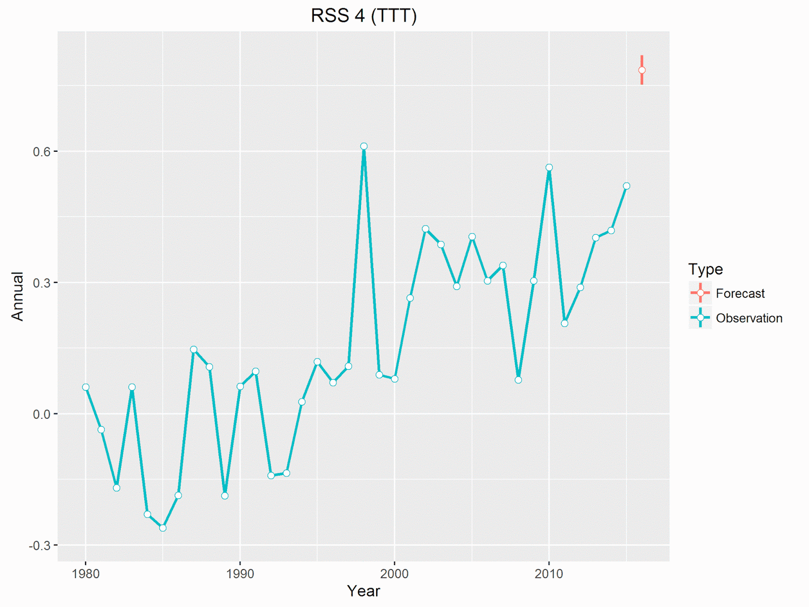
For context here's the annual observations along with the forecast (in red) for 2016. The vertical line indicates the 95% interval.

The forecast is to be quite close to the 1998 record, and much warmer than any other year.

The forecast is based on the correlation between the annual temperature and the first 6 months for each year.

This suggests there has been a strong linear correlation between the temperature at the start of the year and the final temperature. There are a few reasons why this correlation shouldn't be a surprise

  • The annual figure includes the initial values. In other words, by this point half of the annual figure has already been determined.
  • The temperatures for both the start of the year and the whole year are correlated with the underlying trend. That is, because temperatures have increased over time, and years that starts warm are likely to be from the warmer period, and so are more likely to see a warmer end to the year.
  • There is some correlation between the start and end of the year even allowing for the underlying trend. That is years that start unusually hot for their time are more likely to remain unusually hot.

The expected temperature can be read straight from that graph. The start of 2016 has been a little warmer than the start of 1998, and 1998 was quite close but a little below the predicted value.

One note of caution is that a fair proportion of the trend line is only supported by two years, 2010 and 1998. On the other hand, it does show that both the strong El Niño years finished up close to their predicted values.

The trend line gives us the expected temperature for the year. This is the temperature we'd expect to get on average, if we had a large number of years all starting with the same temperature. In order to estimate a probability of beating any specific temperature we need to generate a distribution for the range of specific values. This is obtained by calculating the prediction interval (by which I mean I get R to calculate it). I then hack the figures a bit to get the correct scale. The distribution looks like this.

The dotted line shows the 1998 record anomaly, and the shaded are shows where 2016 has to be to beat it. This translates into an 80% probability of beating the 1998 record.

How Plausible are These Forecasts?

Taking another approach (that used by Roy Spencer) we can look at what actually needs to happen in the second half of 2016 to beat the record. For UAH beta 6 the second half of 2016 has to average more than 0.348 °C (using UAH's 1981 - 2010 base period). This compares to the first 6 months of 2016 which was 0.617 °C, and the second half of 1998, which was 0.373 °C.

For 2016 not to be a record would require the biggest difference between the first and second halves of the year in the UAH record. The biggest difference was in 1998 when temperatures dropped by 0.239 °C. By contrast 2016 will need to drop by 0.269 °C - so either way 2016 will set some sort of record!

Here's what 2016's monthly values look like compared with 1998, with the dotted line showing the average temperature needed for the rest of the year to break the record.

Although 2016 started off considerably warmer than 1998, the last two months have shown a much quicker drop than anything seen in 1998. Temperatures will actually need to increase from the June figure to beat the record, but if 2016 reflects the pattern of 1998 temperatures should continue dropping. If this happens there would be no chance of 2016 beating 1998.

It seems likely that temperatures will continue to drop, as they did in 1998, but it's not certain as 2016 is not behaving in the same way as 1998. Overall, based on intuition rather than statistical inference, I suspect the odds on UAH beta 6 setting a record are low - say around 10%.

So why would the statistical analysis be so wrong? In some ways I don't think it is actually wrong, it's just that it predicts the general case. Saying there is an 80% chance of record means that if we had a large number of different years, all starting with the same temperature, 80% would be warmer than 1998, but it doesn't predict which specific years will be in that 80%. You can always bring more knowledge about what a specific year is doing that will suggest if this particular year will be in that 80% or not.

I have tried other statistical approaches, and want to introduce at some point one that gives a better overall performance. This combines the underlying trend with the start of the year, but I'm reluctant to use it at this stage as it actually increases the probability of a record, going in completely the wrong direction to what I expect to happen.

A more accurate statistical method would probably require more advanced methods, such as deep learning, which is outside my experience.

Additional Comments

Whilst it is interesting that despite the strong start to the year UAH beta 6 will probably not set record this year, that tells us little about the state of global warming. For a start we are only talking about one data set, and one that is still unofficial and unpublished. Whilst I'd reduce the odds on all the other data sets breaking a record, they all have more chance than UAH beta 6. My estimates for the other data sets would be that RSS 3.3 has around a 50% chance of setting a record, and the other sets all have 75% or more. (These estimates are as above just my gut feeling.)

UAH beta 6 is dominated by the exceptional value it gives for 1998. 2016 is still likely to be close to the 1998 value and 2016 is very likely to be at least the 2nd warmest year in their history, and is almost certain to be warmer than 2015.

What makes 1998 so unusual is that it came out of much cooler conditions. The two years preceding, and the two years following 1998 were all close to the 1981 - 2010 average. They were warm by 20th century standards, but cold compared to the 21st century. By contrast 2016 follows two very warm years. Possibly one reason this El Niño is dropping more quickly than 1998 is that it has already produced more heat over the previous year. This graph compares monthly values for the three years leading up to 1998 and 2016.

One consequence of this is that the two years 2015 and 2016 are almost certain to be the warmest 2 consecutive years on record, and the three years from 2014 - 2016 will be the warmest 3 consecutive years on record.

The Other Satellite Data Sets

For completeness, here's what the other versions need to do to beat their respective records..

All of them can afford to drop some more and still beat 1998.

Update - 1st August

No sooner had I written the above, when Roy Spencer announces that the UAH beta 6 value for July 2016 showed a slight increase on the June value - up to 0.39 °C.

This hasn't had too much of an impact on my forecasts. The statistical method shows a slight reduction in the probability of this data set breaking a record, down to 78%. I'd still agree with Spencer that UAH will beat the record this year, but the fact that the temperatures went up must increase the odds slightly, if only because it suggests more uncertainty in the temperatures.