Wednesday 7 December 2016

Tracking 2016 - November Satellite Update

Here's the latest in my ongoing look at how 2016 is shaping up temperature wise. This includes all data sets up to October 2016, and all the satellite sets (excluding UAH 5.6) for November.

Monthly anomalies for each data set - based on period 1981 - 2010.

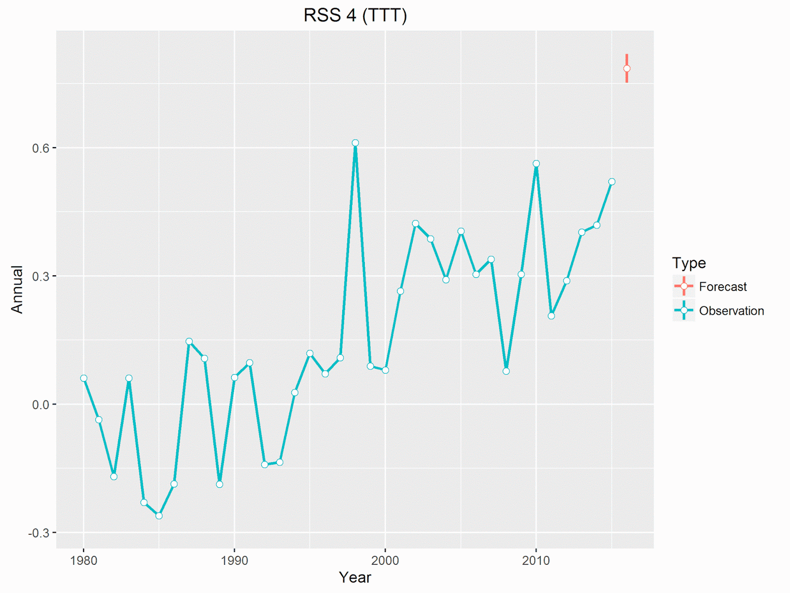
All the satellite sets rose in November, with UAH beta 6 setting a record for November by some way. In fact it beat the record set in 2015 by 0.12 °C. This also means that the 12 month rolling average set a new record, 0.52 °C, 0.04 °C warmer than the peak in 1998. RSS 3.3, was only the second warmest November, losing to the previous record (set in 2015) by 0.07 °C. The current version of RSS 4, for TTT, also set a record for November, beating 2015 by an impressive 0.18 °C.

Projections for difference between each data set and its previous record year.

The projected amount by which each set will beat its previous record haven't changed too much. November saw a small rise in projections for UAH 6 and RSS 4, but a small reduction in RSS 3.3. UAH 6 and RSS 3.3 are now very similar, with both looking to be around 0.2 - 0.4 °C warmer than 1998.

Changing probability by month of each data set beating its previous record.

The projected probability of 2016 setting a record hasn't changed much, with the notable exception of UAH beta 6, which now jumps from a 75% chance in October to a 97% chance. I think this is more reasonable than before. With only one month to go UAH beta 6 will have to be -0.02 °C in December, a drop of 0.47 °C from November - not impossible by not very likely.

Roy Spencer agrees that it now seems virtually impossible for 2016 to not be a record warm year in the UAH dataset, but then points out that it will probably not be statistically significantly different to 1998 given the uncertainties in the satellite dataset adjustments. This is probably true, and it's good to see confirmation that there are uncertainties and that the satellite data set is adjusted. However, it also seems a little disingenuous - not being statistically different only means there may be a small chance that 1998 was warmer, but then if every other data set also shows 2016 being warmer than 1998, possibly by bigger margins it becomes much less likely that they are all wrong.

In any event, it really doesn't matter which year was warmer, it will make very little difference to the underlying trends.

One Other Thought

Something David Rose mentioned in his recent Sunday Mail article:

This means it is possible that by some yardsticks, 2016 will be declared as hot as 2015 or even slightly hotter – because El Nino did not vanish until the middle of the year.

Firstly, it's looking very likely that all yardsticks will be showing 2016 as being warmer than 2015. Secondly, I'm really not sure what he means by slightly hotter.

Of the 4 surface data sets I've been looking at, NOAA and HadCRUT are the two likely to be close, currently estimated to be around 0.05 °C warmer than 2015, but may drop a bit over the next two months. The other two, BEST and GISS are both looking like being more than 0.1 °C warmer

Satellite data is currently projected to beat 2015 by even more (remember in the satellite data 2015 wasn't anything like as warm as 1998). All 4 data sets, both the old and the new UAH and RSS, are projected to show 2016 as beating 2015 by around 0.2 - 0.25 °C.

Here's what this looks like for the two latest satellite data sets.

Annual temperature anomalies for UAH beta 6, with projection and 95% prediction range for 2016. (Prediction based on data through November.)
Annual temperature anomalies for RSS 4 (TTT), with projection and 95% prediction range for 2016. (Prediction based on data through November.)

Neither of these suggest 2016 will be only slightly hotter than 2015.

Saturday 3 December 2016

Stunning New Nonsense From David Rose

I'll have the next update for 2016 soon, but with Roy Spencer announcing that UAH rose slightly in November, it seems highly likely that all datasets will make 2016 the warmest year on record. The joke has always been that in a few years time this will lead to 2016 being declared the start of a new pause.

Except we didn't have to wait that long. In the last few days there's been a flurry of nonsensical articles pointing to the rapid decline of temperatures following on the peak of the recent El Niño, as evidence for the end of global warming, or the start of a new ice age, or whatever.

Tamino has some great articles detailing the sorry history:

Here's my own take. This started with an article in a Mail on Sunday article by David Rose, with the catchy headline Stunning new data indicates El Nino drove record highs in global temperatures suggesting rise may not be down to man-made emissions . The headline claims in the article are:

Global average temperatures over land have plummeted by more than 1C since the middle of this year – their biggest and steepest fall on record.

The news comes amid mounting evidence that the recent run of world record high temperatures is about to end.

The fall, revealed by Nasa satellite measurements of the lower atmosphere, has been caused by the end of El Nino – the warming of surface waters in a vast area of the Pacific west of Central America.

The second two points are obvious and irrelevant. Of course the run of record breaking weather will end, it would be terrifying if it didn't. And you don't need NASA to tell you that the end of an El Niño causes a fall in temperatures.

Tellingly, Rose never quotes a source for the data he's using, but it's clearly the RSS v3.3 TLT land data. But using that source his claim that temperatures have plummeted by more than 1C since the middle of this year is not correct - they've dropped about 0.5 ° C since the middle of the year - you have to go back to March to make the case for a drop of 1 °C.

Rose claims that this is the biggest and steepest fall on record, but doesn't back this up with any figures. Nor does he really explain what significance he attaches to this fall. If the fall is simply the fall from a very high peak, it means nothing and is expected. If he's suggesting that this trend is meaningful and will continue he's almost certainly going to be wrong. (In fact as I write November's RSS figures have been published and show land temperatures rose by over 0.2 ° C.)

But he's wrong to claim that this is the sharpest fall on record (assuming he means over any 8 month period). The trend from March to October was -127.6 ° C / century, which alone should tell you how meaningless an 8 month trend is. But this is only the 6th sharpest 8 month fall. By contrast the 8 months from August 2015 to March this year saw an upward trend of 156.3 ° C / century. This was the steepest 8 month rise in RSS TLT land temperature history.

I suspect that what Rose actually did was take the difference between the temperatures for March and October. That does give you the claimed biggest difference, but it's a terrible way to calculate the steepness of the fall. It ignores all the months between the start and finish, and in this case gives far to much prominence to that single cool final month.

But the main question is why did he only refer to land temperatures, rather than global temperatures? It's difficult to avoid the suspicion that it's purely cherry-picking. Here's a graph showing the last 2 years of RSS 3.3 TLT data for both land and global temperatures.

It's obvious from the graph that the peak of El Niño was much higher over land, and there was one very big drop in October over land, compared with a much smaller one globally.

Rose's justification for only looking at land values is:

The satellite measurements over land respond quickly to El Nino and La Nina. Temperatures over the sea are also falling, but not as fast, because the sea retains heat for longer.

This gives the impression that sea values will catch up with the land values, but this is not really true. It isn't that the land responds more quickly than the sea, it's that the land responds more strongly. To illustrate the problem, here's a comparison of the entire data set for RSS using a 12 month rolling average.

A few things seem obvious from this graph:

  • There's no evidence that the globe responds slower to El Niño or La Niña events. The peaks and troughs are happening at the same time.
  • Land values always show higher peaks during El Niños, and bigger drops during La Niñas
  • The difference between the two values in 2016 was the biggest on record.
  • The global peak in 2016 was higher than the super El Niño peak in 1998, but the land only peak in 2016 was much higher than the one in 1998.
  • In part this can be explained by the fact that land only temperatures are increasing faster than global temperatures.

To put figures on that last point - the global trend given by RSS 3.3 over the entire satellite era is 1.36 ° C / century. But for land only the trend is 1.79 ° C / century.

Which raises one obvious question - do those trying to deny the existence of global warming really want to emphasize the land only data?

Post Script

It should also be mentioned that all the above is using the old 3.3 version of RSS. The newer version 4 (TTT, land) only shows a 0.54 ° C drop between March and October, whilst November 2016 sets the record for warmest November.