Monday 24 April 2017

Cold Winter Nights With Steve Goddard

Following on from my last post here's another interesting example of Tony Heller using odd statistics to make a point. In this case however it isn't so much the oddness of his statistics that are a problem, it's his entire argument. The post in question The Trouble With Satellites, which claims that satellites are exaggerating global warming by starting at an exceptionally cold period. It's a long post, but the only meat is in the first couple and final paragraphs, and can be summarized thus:

  1. Whilst Satellite data is infinitely better than surface data, it has a major problem in only going back to 1979.
  2. This was the coldest period in the US in the last 90 years, and so any rise in temperatures since then is misleading.
  3. Therefore Heller sees little or no evidence that Earth is warmer now than it was in 1940.

The first point is debatable - Heller obviously prefers satellites because they show slightly less warming especially this century - but both satellite and surface data have different problems and where there are differences there's no good reason to assume one must be correct and the other wrong. But I agree that one advantage surface data has over satellites is their longer reach. That satellites only going back 40 years makes it difficult to put any differences in perspective.

It's the second point that is the main problem. Heller says:

But there is a huge problem with satellite temperatures. They start in 1979, which was the coldest period of the last 90 years in the US. The frequency of below 0F (-18C) nights peaked in 1979, and then dropped in half by the year 2000, before starting to increase again.

One obvious problem here is that, as always he's only looking at the US, which tells us little about global temperatures. Even then, Heller is vague about what he means by 1979 being the coldest period in 90 years. His graph shows a 5 year rolling average of the percentage of days below 0°F, that's around -18°C in real money. As with his hot summer data this is a dubious way of measuring how cold the US was around 1979; obviously it's only going to show winter weather, and it will only be a small part of the US that will affect the graph.

As it happens, he didn't really need to go to all the trouble of inventing weird measures. NOAA's own website shows that 1979 was indeed the coldest winter on record, not just in the last 90 years. Beating the previous record set in 1936 by over 1°F.

NOAA - US Winter Temperatures

Even if, more logically, we look at the whole year, 1979 was also cold in the USA. Annual US temperature Not quite the coldest in 90 years (1929 beats it by a smidgen), but pretty much.

But if we look at the 5 year average, as Heller seems to be, we see that the first 5 years of the satellite era (1979-1983), was not at all the coldest period in the last 90 years.

NOAA - US 5 Year Mean Temperatures

But if we don't put America first, and instead look at global temperatures, the first 5 years of the satellite era were at a local high, warmer than the warm 1940s.

NOAA - Global Temperatures 5 Year Means

Heller's claim that satellites started at the coldest period of the last 90 years, is meaningless.

As far as hi closing remark that he can see no evidence that current temperatures are warmer than the 40s, this may well be correct as far as Heller's eyes are concerned. I assume he's not looking very hard, and can easily disregard any evidence to the contrary as fraud. But as an example that there is some evidence that temperatures are warmer than the 40s, we can use Heller's own technique of aligning 5 year averages at the start of the satellite era.

Wood For Trees

Satellite temperatures are around 0.4°C above the mid-40s peak. If we do what Heller seems to prefer and use land only data the warming is even greater compared with the 40s; around 0.7°C warmer.

Wood For Trees

One final point though, using the first 5 years of the satellite data as a base point is not logical. It makes an assumption that satellite and surface data precisely agreed with each other at the start and have been drifting apart ever since. But there's no reason to suppose the years 1979-83 were the the same - it's just as plausible that the satellites were too high (or the surface too low) at the start and are becoming more accurate later. In fact this seems quite likely when you consider that the first 5 years include a strong El Niño, and satellites usually show more warming than surface data during El Niños. Changing the offset slightly can produce a slightly more consistent comparison.

Wood For Trees

Wednesday 19 April 2017

Steve Goddard's Absolutly Hot Summer Days

One constant Tony Heller (sometimes known as Steve Goddard) is noted for is his ability to find any weird statistic that he can present as conclusive evidence that the better known statistics are wrong, especially those showing more warming than he likes. For example in the post One Of The Most Fraudulent NOAA/EPA Graphs, he says of one specific graph:

NOAA, NASA and the EPA specialize in generating fraudulent climate graphs, but few are easier to disprove or more fraudulent than this one, which shows that the area of the US experiencing hot summers is increasing and has reached record highs.

So easy is it to disprove the graph, Heller doesn't even try. Instead he states,

The graph is wildly inaccurate and shows the exact opposite of what is happening. US summers are getting much cooler.

The graph in question is Figure 2 of the EPA Climate Change Indicators, which shows the percentage of the USA with unusually hot summer temperatures.

Figure 2. Area of Contiguous 48 States With Unusually Hot Summer Temperatures, 1910-2015

The data for this comes from NOAA, but NOAA's version of the graph is more up to date. EPA and NOAA's definition of an unusually hot summer is one that is in the upper tenth percentile for the long term temperatures at each location. And summer is defined as the average of the months June, July and August.

Heller never explains exactly what he thinks is fraudulent here - whether it's their calculations, or their definition of unusually hot. All he does is use a completely different definition of a hot summer and show that this gives slightly different results.

Heller defines a hot summer as having one or more days above 35°C. His first graph shows the percentage of stations that reached 35°C at least once during the summer, the next two graphs require 10 or 20 days to have have been that hot. Here's what his 20 day graph looks like.

His graph differs from the EPA's in a couple of important ways

  • He defines hot using an absolute temperature irrespective of the normal temperature in a region. This means some locations, especially in the north of the country will never have hot summers, whilst other parts of the country will almost always have hot summers. This also means that a relatively small part of the country will make up most of the changes in the graph.
  • He's really looking at heatwaves rather than overall summer temperature. A location might have a few weeks of very hot temperature, but two months of very cold weather and will be considered hot using Heller's definition, but cool by NOAA's, whilst another location might be close to 35°C for three months and be considered hot by NOAA's definition, but not hit by Heller's.
  • The EPA graph is showing the geographic area experiencing unusually hot summers, Heller is only showing the percentage of stations. As stations are not evenly distributed across the USA this could make a difference.
  • It's clear that Heller's definition gives different results to NOAA / EPA's simply by comparing the percentages. EPA's graph shows there has never been a year where more than 50% of the USA had an usually hot summer, and many years where less than 10% was hot. Heller's first graph shows there was never a year when less than 50% of the USA had a hot summer, and some years where almost all the country was hot. Even his graph showing sites with 20 hot days in a summer rarely shows less than 20% of stations having an unusually hot summer.

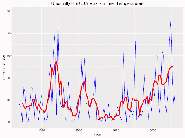
One point that mat be confusing the issue is that the EPA graph shows both summers that had unusually hot maximum (day time) temperatures, along with summers that have unusually hot minimum (night time) temperatures. Night time temperatures have been warming faster than day time, which might explain why Heller claims the graph shows record highs. Here's my graph using the EPA data, showing only the unusually hot maximum temperatures, with a 5 year running average (which I think is what Heller uses in his graphs.)

Area of Contiguous 48 States With Unusually Hot Summer Max Temperatures, With 5 Year Smoothing.

Note that contrary to Heller's claim the graph does not show that hot summers in the US have reached record highs. The record individual year was in 1936, and the smoothed average is more or less the same as the peak in the 30s.

Heller might prefer his own definition of hot summers (he carefully avoids using the word unusually), but the fact he's measuring something different to the EPA means he cannot use his graphs to prove the their one is fraudulent.

But the really strange part of Heller's accusations is that the EPA site does have a graph measuring something a little closer to Heller's desire to measure heatwaves, and it's the first graph you see when visiting their page.

Figure 1. U.S. Annual Heat Wave Index, 1895-2015

It shows a very strong peak in the 30s, pretty much obscuring any changes before or after. Heller acknowledges this graph, but tries to make the existence of this graph part of the criminal activity, claiming its existence is down to incompetence on the EPA's part:

These climate criminals are not very good at covering their tracks however. The same EPA web site has another graph which shows the same thing as my graphs.

Yet this graph is not at all like any of Heller's graphs - if anything Heller's graphs are much closer to the one he considers fraudulent.

Monday 3 April 2017

Fake Newts from Steve Goddard

A puzzling bit of nonsense from the ever reliable Deplorable Climate Science Blog, in his post Donald Trump Turned Her Into A Newt. This concerns an article in the Guardian I am an Arctic researcher. Donald Trump is deleting my citations by Victoria Herrmann. Aside from his Pythonesque newt obsession, Heller takes exception to her claim that:

These back-to-back data deletions come at a time when the Arctic is warming twice as fast as the global average. Just this week, it was reported that the Arctic’s winter sea ice dropped to its lowest level in recorded history.

Not so, says Heller:

Arctic sea ice extent is about the same as it always is this time of year, but climate alarmists never let facts get in the way of their brainless hysteria.

The evidence he provides to back up this claim is this graph from the Danish Meteorological Institute, DMI.

Ocean and Ice Services | Danmarks Meteorologiske Institut

The red line shows current Arctic sea ice extent, whilst the other colored lines show the previous 4 years. 2017 is currently around the lowest or equal lowest of any of the years in the graph, and all 5 years are a lot lower than the 1981 - 2000 average extent for this time of year. In fact all 5 years are more than 2 standard deviations below the average for this time of year. How this can be interpreted as being about the same as it always is is a question best left to the brain of Tony Heller.

Personally, I prefer NSIDC's charts, if only because they're clearer (using a 5 day average), and interactive. These show the Arctic currently has more than one million square kilometers less sea ice than the average for 1981 - 2010, and has been at or near an all time low since October of last year.