One constant Tony Heller (sometimes known as Steve Goddard) is noted for is his ability to find any weird statistic that he can present as conclusive evidence that the better known statistics are wrong, especially those showing more warming than he likes. For example in the post One Of The Most Fraudulent NOAA/EPA Graphs, he says of one specific graph:
NOAA, NASA and the EPA specialize in generating fraudulent climate graphs, but few are easier to disprove or more fraudulent than this one, which shows that the area of the US experiencing hot summers is increasing and has reached record highs.
So easy is it to disprove the graph, Heller doesn't even try. Instead he states,
The graph is wildly inaccurate and shows the exact opposite of what is happening. US summers are getting much cooler.
The graph in question is Figure 2 of the EPA Climate Change Indicators, which shows the percentage of the USA with unusually hot summer temperatures.

The data for this comes from NOAA, but NOAA's version of the graph is more up to date.
EPA and NOAA's definition of an unusually hot summer
is one that is in the upper tenth percentile for
the long term temperatures at each location.
And summer is defined as the average of the months June, July and August.
Heller never explains exactly what he thinks is fraudulent here -
whether it's their calculations, or their definition of unusually hot
.
All he does is use a completely different definition of a hot summer and show that this gives slightly different results.
Heller defines a hot summer as having one or more days above 35°C. His first graph shows the percentage of stations that reached 35°C at least once during the summer, the next two graphs require 10 or 20 days to have have been that hot. Here's what his 20 day graph looks like.

His graph differs from the EPA's in a couple of important ways
- He defines hot using an absolute temperature irrespective of the normal temperature in a region. This means some locations, especially in the north of the country will never have hot summers, whilst other parts of the country will almost always have hot summers. This also means that a relatively small part of the country will make up most of the changes in the graph.
- He's really looking at heatwaves rather than overall summer temperature. A location might have a few weeks of very hot temperature, but two months of very cold weather and will be considered hot using Heller's definition, but cool by NOAA's, whilst another location might be close to 35°C for three months and be considered hot by NOAA's definition, but not hit by Heller's.
- The EPA graph is showing the geographic area experiencing unusually hot summers, Heller is only showing the percentage of stations. As stations are not evenly distributed across the USA this could make a difference.
- It's clear that Heller's definition gives different results to NOAA / EPA's simply by comparing the percentages. EPA's graph shows there has never been a year where more than 50% of the USA had an usually hot summer, and many years where less than 10% was hot. Heller's first graph shows there was never a year when less than 50% of the USA had a hot summer, and some years where almost all the country was hot. Even his graph showing sites with 20 hot days in a summer rarely shows less than 20% of stations having an unusually hot summer.
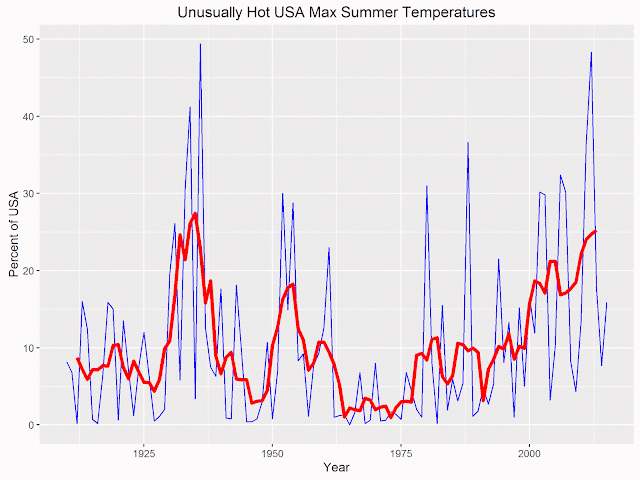
One point that mat be confusing the issue is that the EPA graph shows both summers that had unusually hot maximum (day time) temperatures, along with summers that have unusually hot minimum (night time) temperatures. Night time temperatures have been warming faster than day time, which might explain why Heller claims the graph shows record highs. Here's my graph using the EPA data, showing only the unusually hot maximum temperatures, with a 5 year running average (which I think is what Heller uses in his graphs.)

Note that contrary to Heller's claim the graph does not show that hot summers in the US have reached record highs. The record individual year was in 1936, and the smoothed average is more or less the same as the peak in the 30s.
Heller might prefer his own definition of hot summers
(he carefully avoids using the word unusually
), but the fact he's measuring something different to the EPA means he cannot use his graphs to prove the their one is fraudulent.
But the really strange part of Heller's accusations is that the EPA site does have a graph measuring something a little closer to Heller's desire to measure heatwaves, and it's the first graph you see when visiting their page.

It shows a very strong peak in the 30s, pretty much obscuring any changes before or after. Heller acknowledges this graph, but tries to make the existence of this graph part of the criminal activity, claiming its existence is down to incompetence on the EPA's part:
These climate criminals are not very good at covering their tracks however. The same EPA web site has another graph which shows the same thing as my graphs.
Yet this graph is not at all like any of Heller's graphs - if anything Heller's graphs are much closer to the one he considers fraudulent.
No comments:
Post a Comment